Ideas For Flyer Design: What To Include In Your Next Promo
Promotional flyers are one of the most tried and tested methods of marketing. Especially if you’re a business, trying to reach out to a local audience. By creating a great flyer design, and placing it strategically, you can target and draw the attention of your customers.
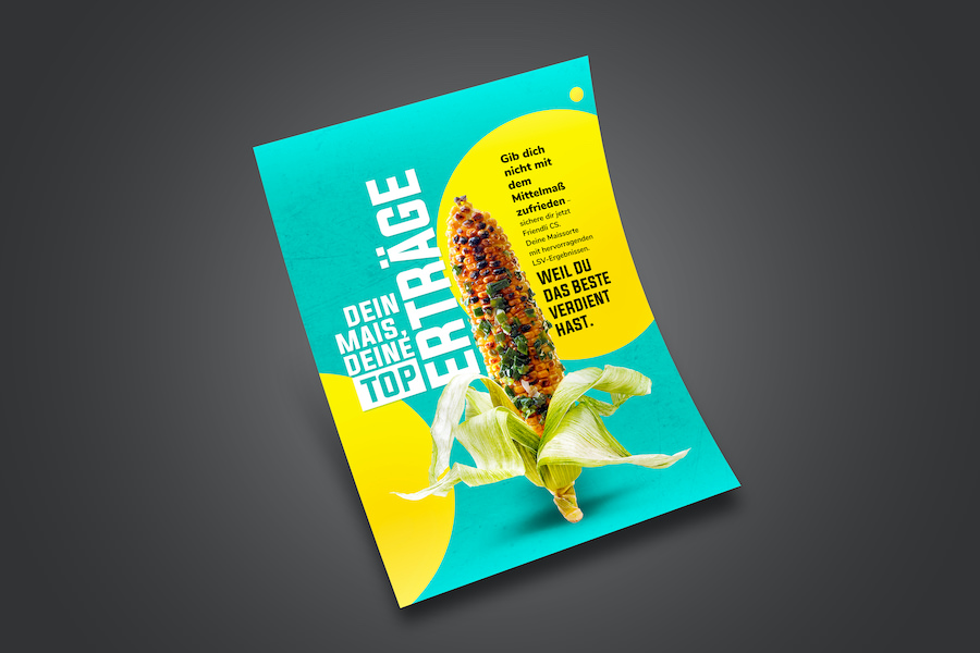
And you can land on the radars of potential new customers as well. Be it for sales, fundraisers, or events. Now sometimes, it can become challenging to create the perfect flyer design. You might have a lot of details and be at a loss as to what to include. Or you might have seen a few really great flyer design ideas. But you’re not sure what will work for you.
The good news? There is more than one way to design a promotional flyer. And they can be rather versatile. As long as you follow a few best practices, that is. We’re going to be giving you all the help you need for just that in this blog. So if you are looking for some ideas for flyer design you are in the right place.

How to create a great flyer design
Ideas for flyer design: Get clear on your brand guidelines
Before you start designing, make sure that you are clear on your brand’s style guidelines. If you don’t already have style guidelines in place, have a look at this blog to help you get started. The reason why this is important is that it’s easy to lose focus when you’re looking at a whole bunch of different references. And you might get sidelined and start imagining your flyer design using another brand’s aesthetic. You can take some inspiration from others’ ideas for flyer design, of course. But you’ll want to make sure that your flyer design is based on your own brand’s look and feel.
Don’t have much time to prep a style guide? Here’s the gist of what you’ll need to be sure of before you get started:
- How should your logo be placed and used? Are there certain variations and placements you’re okay with? Be sure to let your designer know what the limits are on.
- The types of font or fonts that represent your brand appropriately. Remember to prioritize those which can be read easily, at a distance.
- Your color palette. Here we’re talking about your brand colors and colors which complement your brand colors and can be used for contrast or emphasis. It’s important to remember that you should only be using colors appropriate for your brand. Let’s say that you are a bank and you are doing a promotion for free consultations. You’d be better off using blue or green, in shades that convey trust and prosperity over neon colors just to get attention.
- Your target audience and the overall style you’re going for. What’s the feeling people should get when they see your flyer design?
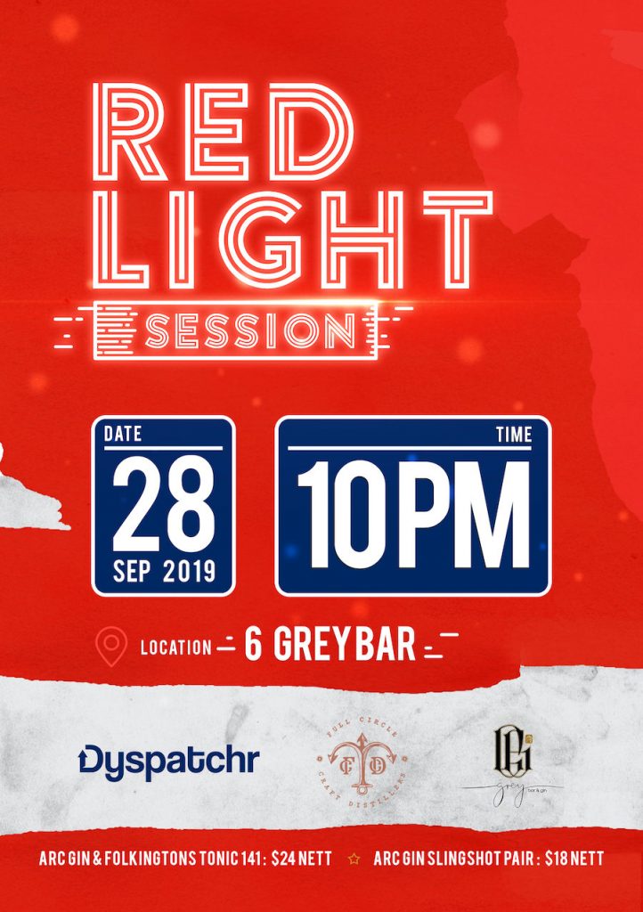
Ideas for flyer design: Be sure to KISS
Keep it simple, silly! That’s what KISS is all about. When you add in too much of anything to the design, your customers will be overwhelmed. For example, images, shiny letters, lots of embellishments and other such elements all combined will make the flyer very busy. The copy and the images, however, should be very cohesive and complementary. Some of the best flyer designs are the ones that keep the design simple but punchy.
Ideas for flyer design: Design with the audience in mind
Your brand’s style guide should be created with your target audience in mind. That said, when it comes to your flyer design this same idea applies to your messaging. Your text copy needs to be written in a tone that reflects your brand’s personality and is relatable to your audience. Now is not the time to experiment with new slang. Use what’s tried, tested, and true. You can test out variations of text copy more easily, and at a lower cost with digital marketing. But when it comes to flyers and other printed designs, you’ll want to keep it simple.
Once you’ve landed on your text copy, make sure that you are giving the message enough weight throughout the design. Work with your designer to create a visual hierarchy that makes it clear what the focus of the flyer design is. At the same time, the additional details beyond the focal point shouldn’t cause clutter or confusion. They should be laid out in a way that makes it easy to gather all the information needed to take the action you’re encouraging. Make sure that the fonts, styles, and colors that you use, will play to that.
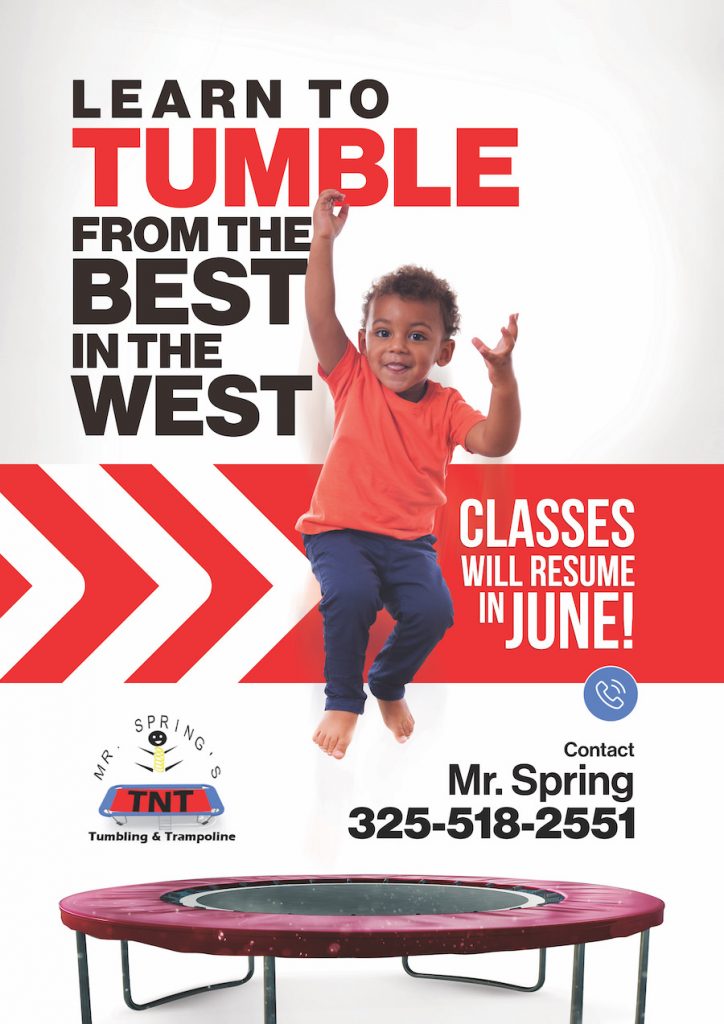
Ideas for flyer design: Your design needs to consider placement
Where will your flyer design be displayed? Are you going to be putting it on a bus for example or on street furniture? Or maybe in your storefront? How close or far away will your audience be when they view it? Considering placement is how you set yourself up for success with your marketing. You need to make sure that the font is just the right size to be visible to your audience. You can also play with the weight of the font in your design, by making it bold or even extra-bold.

Color also has a role to play here. The colors that you use should help make your flyer itself stand out. Remember, it’s going to be in a sea of other things vying for your audience’s attention. The colors you choose should also make the elements in your flyer stand out. This way your messaging and what you’re promoting is clear. The right designer will be able to balance all of and create a sense of cohesiveness. So that even at a glance, your audience understands what you’re trying to explain. And the better results you will have.
Ideas for flyer design: Carefully choose your colors
Color is a big deal in your designs, so we’re going to delve into it a bit more. The colors you choose for any design can make or break it. If you’ve read our blog on how color psychology works, you’ll have a sense of why. But in a nutshell, colors evoke emotions and create moods in the mind of the viewer. This means that simply by using a particular color, you can associate your brand with trust, or vitality, or peace, for example.
When creating a flyer design, don’t default to a blaring red, orange or yellow, just because. Yes, these colors can be highly effective to get customers’ attention. But you need to think about the purpose of your promotion. And what would compel your target audience to be intrigued. What would make them go as far as to want to take advantage of your promotion? And what will work alongside your brand colors and in the particular placement where your flyer will be? Factor all of this in before you decide how to add in color for contrast, and to get people excited about your promotion.

Ideas for flyer design: How to pick your font
For flyer design, the golden rule for font selection is that it must be easy to read. But there’s a lot more to consider too. The fonts that you select will have a big impact on the overall style and personality of the flyer. Want to make it feel young and modern? Try something that is cool and clean like a sans serif font. If you want to give off a serious vibe, go for a serif font.
Now if you want to convey a message that is elegant and classy you might be tempted to use a script font. A word to the wise here, script fonts can be difficult to read. So if your flyer is going to be viewed at a distance, that’s a big no-no. One of the very few exceptions is if your flyer will be viewed up close. This could be the case if it’ll be displayed at the point of purchase, next to a cash register for example. In these cases, you have a little more wiggle room to experiment with a script font. Just err on the side of fewer embellishments and more clarity.
Ideas for flyer design: Images, elements, and copy
So far we’ve talked about fonts, and colors, and a bit about messaging and copy. Now we’ll take a look at how they all need to come together. When you first start thinking about all the elements that should be in your flyer, give yourself some limits (i.e. you should be aligned with your brand guidelines). But beyond that, try to collect as many different relevant references as you can to share with your designer.
In terms of your messaging, let your designer know if they have any wiggle room to reduce the text if it’ll benefit the design. To make sure they’re crystal clear on what you need, consider giving them a couple of options to choose from. This means options of varying lengths of copy.

When creating the copy you will need a headline that is powerful and catchy. You are talking about a promotion, so make it direct, clear, and exciting to build some hype. Next, put in the details of your business. This could mean just your logo and website. Or it could also include any combination of your business name, logo, address, website, contact number and/or email.
It really depends on what you’re promoting and what your audience needs to know to access it. In terms of descriptive text to accompany your headline, keep it clear and if possible, creative. And finally, include a strong call to action.
Ideas for flyer design: Give your designer some guidance
As far as different fonts, images, and other elements, try to gather a few different samples. This will help your designer get a sense of the range of styles you’re comfortable with. When you provide some examples of what the elements could be, it will be easier for your designer to figure out the best choice for the layout.
For instance, have a lot of images and copy that you have to put on the flyer about your promotion? Then you shouldn’t use a font that is too large as it would overcrowd the design. But if your flyer will be viewed at a distance, a large font might be non-negotiable. And you’ll want to eliminate some of your text and/or other elements to create that space.
On the other hand, if there are just one or two lines of copy, you can play around with striking imagery more so. You’ll have ample space for it. If by any chance you are going to be using Stock images, make sure that you use only high-resolution images.
Ideas for flyer design: Some advice for developing a compelling CTA
Your call to action has to be very impactful. Sometimes this can be easier said than done when you’re balancing many different details. So let’s break this down. When you design a flyer, your goal is to get people to take advantage of what you’re offering.
So your CTA should ask people to take part in the promotion and make the best of it. And your flyer should include the details they need in order to do so. For instance, if you’re promoting a sale, with exclusive online deals, make sure your website is clearly visible. Or if you are promoting an event, make sure that registration details are easy to read and relatively close to the call to action, e.g. “Limited Space – Sign Up Today!”
The visual hierarchy of your design, you should clearly guide your audience’s eye from the headline to the CTA. This way, you’re shortening the time from the moment that your flyer catches their attention, to the moment they see how to take advantage of the promotion.

Ideas for flyer design: White space aka negative space
For any flyer design, white space or negative space is key. Just because you have a lot of real estate to work with, doesn’t mean you should ever cram in every detail you can. Rather, you want to make sure that there is enough breathing room between all the elements of your flyer. Everything in your flyer should have a clearly defined space, and purpose. And it should be easy to see what those are in the layout of the design.
Ideas for flyer design: Repurpose your flyer design for social media
When you bring your campaign online, you’ll have the opportunity to play around with a few different variations of your design. First thing’s first though. Keep in mind, a print design is created using the CMYK color mode, whereas designs created for digital purposes need to be created using the RGB color mode. So it’s not just a matter of simplifying resizing the design. And that’s why it’s important to let your designer know about your intended placements, so that they can design accordingly.
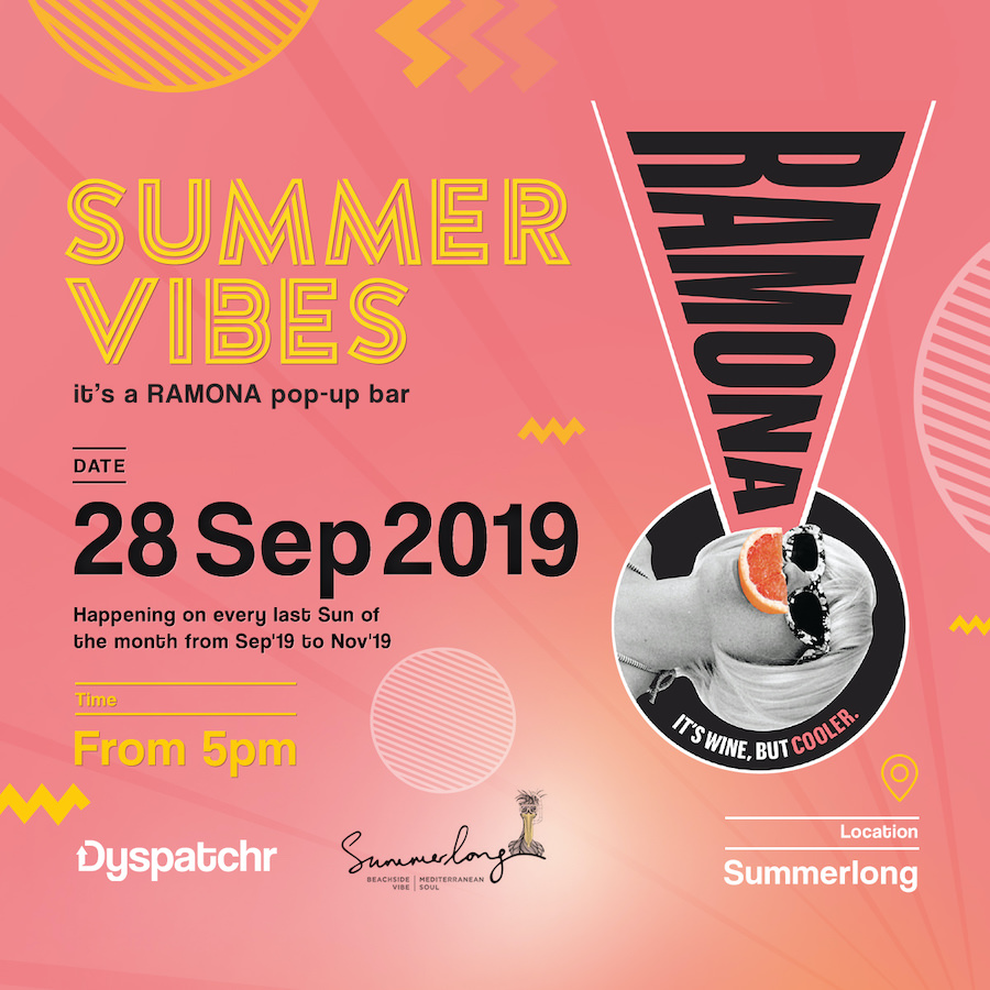
Your concept for your flyer design can take different forms online (i.e. banners, newsfeed posts, Story posts, etc.). But stick to the same look and feel. Here we’re talking about the colors, fonts, messaging, and overall style. As you’ll be working with smaller formats, you’ll need to come up with different versions of your promotional messaging. Try just using the headline on your posts, and include more details in your post captions. You can also link to your website or a landing page, if applicable for more information.
You can also try running carousel ads, so that you have a few posts across which to include the details of your promotion. And you can also upload several images as part of a single post on your brand’s social profiles. This will allow you to connect with your followers organically as well.
Get started on your flyer design
So there you have it. You have all the guidelines that you need to create your promotional flyer design. We know that all these best practices together can seem like a lot. In keeping them in mind, you may wonder how you’re supposed to be creative too! It can be a tricky balance, but one that can be achieved, especially when working with experienced designers. Like a dedicated design team from Kimp 😉 Keeping that in mind, your mission, should you choose to accept it is this: pull together all of the details and inspiration for your design. Then hand over the reins to your designer or design team and watch them bring your vision to life.
