Design Ideas To Promote Your Restaurant In 2020
Having a business that is all about food and beverages, means that you need to stay on your feet. You will also have to be really flexible and adapt accordingly to suit the needs of your customers and the current state of your industry. We’ve got some design ideas to promote your restaurant that keep all this in mind.

What we want to bring to you, is a compilation of all those amazing foodie-enticing ideas that you can make use of this year when you are marketing your business. Take a look through and try out some ideas to up your marketing game.
What can you do if you can only offer a delivery and no take-away or dine in?
Let’s assume that you are a food and drink service that will only deliver. That is not something that should discourage you or put you behind your competition in this day and age. Here are some things that you can do, to promote your sales and make sure that you keep your customers engaged.
- Make use of online delivery apps that will help you get your products to your customers. These will allow you to manage the deliveries in a cost effective way. For instance, UberEats – a well known food delivery service also offers you resources such as branded packaging and marketing tools that allows you to promote your business using their platform.
- When you partner up with apps like these, you get the perks of being able to give your customers great offers through loyalty programs. For instance, UberEats will give customers loyalty points or discounts if they visit the app a certain number of times to place orders.
That said, you can also make use of your social media, website, packaging, menus and email marketing to deliver consistent and attractive messaging that will give your customers those hunger pangs. Here are some ways in which you can use each of these mediums to your advantage.
Making the most of your social media
When it comes to design ideas to promote your restaurant, you definitely want to keep social media in mind. Advertise your menu, your specials, and your contact details so customers can place orders.
When you promote your food business on social media, you can try out some of these ideas below to help you get those customers in. They’re not difficult things to do and will definitely give you better leverage.
Use amazing foodie pics
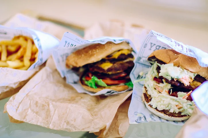
You can either have a pro take these pics for you, or you can take them using your smartphone. But keep in mind that things like angles and lighting will play a role to make those food pics look ultra yummy.
Spice it up with Instagram
Another fantastic way to get people talking about and trying your dishes would be Instagram. Create a personal and relatable experience with amazing photography, help of influencers and food bloggers. You also need to research the right hashtags to gain maximum visibility. In fact, food businesses really thrive on Instagram.
Get your staff out there
No, we don’t mean getting your staff out on the streets, but to rather make a positive impression on your customers by showcasing behind-the-scenes videos and images as well as staff pics on any of your social media. People like to see the hands behind the dishes and it helps to also focus on the point that you value your people, which is always good.
User generated content
This is probably one of the best ways to create some real-time, intimate engagement with your users. You could take it up a notch by hosting a photo competition, for instance, where customers share images of the favorite dish they tried from you. You can carry this out on all your social media platforms and also maybe give, say five lucky winners a free meal or a discount.
A word of caution
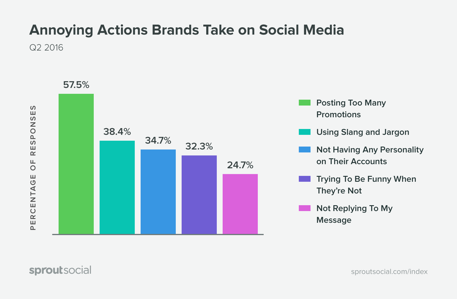
Don’t post just anything. When you’re thinking about design ideas to promote your restaurant you might be tempted to jump onto every trend. You might get a bit carried away and put up posts that will not add value to your brand. Worse yet, it can actually be rather damaging. Take a look below at some of the ‘annoying things’ that businesses can do online that can tick off customers.
Let’s get on your website
Accessible and responsive websites are a must
Keep your website and your menus accessible and responsive. If you are not going to be doing any dine-ins, you need to make sure that your menu is readily accessible and readable online.
If you haven’t got on social media yet (get on it ASAP!)
Assuming that you only have your website and no social media, you will need to include everything that we have spoken about above on your website instead. This includes the contact details, location, imagery, promotions and the likes. You can also have a blog section here and the various reviews that you can link your business to. Some good reviews to put up and link to would be Google Reviews and Yelp.
Branded packaging for your food
Humans are visual creatures. That is why we are drawn to food that we can quite literally eat with our eyes. And design ideas to promote your restaurant don’t have to stop at your storefront and website. The packaging of your food should not be taken lightly. Especially in this pandemic fueled era of takeout and delivery. The main purpose of the packaging would be to keep it warm or cold, and fresh but you should also try and make it visually appealing. The way that you package your food can get your customers to talk about it and even recommend it. Remember that we live in the age of Instagram where #foodporn is thriving. If you pack up well you are giving your buyers a reason to talk about you. In addition to this, choosing eco-friendly packaging will also help you keep your business – in business.
Have awesome digital menu boards
Your digital menu boards should be fun, easy on the eyes and also stand out from your competition. These days it might be that your customers are only stepping into your restaurant or bar to quickly place an order or pick up takeout. Make sure that they like what they see while they’re there.
To help you get started, here are some tips that you can use:
- Use the biggest suitable font size. The font should be clear and easily readable, so do not get too fancy. We’ve got a blog that can help you out with some of the best suitable fonts for just the thing.
- Keep the information to the needed points only. Don’t clutter up the display with too many details.
- When you add images to your menu, think about whether it is actually needed. If you have amazing best-sellers you can include those images, but do not include all of the dishes with images. It will make the display of your menu long and tedious to read, not to mention – cluttered. Note how, in the image below, the dishes have been put on display without making the whole thing look cramped up.
- You also need to use the right color palette. The color palette that is created for your brand should be available to you as a style guide. It should have all the right color codes that you can make use of.
- When you have a menu that has many items on it, using dots or lines to help guide the eye of the customer to the right price is good. It is a good design decision. But if you only have a few items, this component will not be really needed.
- You should also test out the design of your menu from time to time. It is also a great way to keep your content and the design aspect from going out of style. It would be helpful if you can get feedback from your customers about how easy they find it to read the menu. Based on this data you can drive the right actions for improvement.
Email Marketing
- Sending out an email newsletter is a great way to keep in touch with your customers. It will also keep them updated. You can use this option for announcements, promotions and for even just reminding them that their favorite dining experience is just a click away.
- Avoid sending them newsletters too often. Based on how often you roll out new specials, and can share something of value, you may want to send them every couple of weeks or on a monthly basis. If their inboxes are getting flooded with your material, you know where you are directed to next? The spam folder.
Remember all the info we just gave you with any other designs like your display for menus, social media and website? Newsletters need to follow these guidelines too. Keep it simple, do not overdo the information, and make sure your logo and your color palette is used consistently to keep the newsletters recognizable and build brand identity.
It’s time to spring into action!
The food and beverage industry is a very competitive one and it’s been slammed during the pandemic. Which means 2020 is the year to ramp up your marketing and designs to connect with your customers and keep yourself top of their minds. To give you some inspiration, here are some of the campaigns a few big players in the industry have run this year:
Burger King did a lovely promo for their whopper that is preservative- free.
Who knew the 1980s could make such an amazing comeback right? Dominos came up with this ingenious idea.
Boneless-Thugs-N-Harmony did a great number to make their fans get excited over wings:
So, over to you. Research your competitors’ strategies, keep up with the latest trends and make sure that what you post shares real appeal. Be as creative as you can withcAnd above all else, make sure that the food you send out is just par excellence to keep your customers coming back for more. After all, good marketing needs to be backed up by even better service.


