Design-Led Content Marketing: Why It Matters To Your Brand
Even before the pandemic consumers were increasingly active online. And now that’s only accelerated. Recognizing this, marketers are pumping out content at a rate that can be overwhelming for their audiences. So how do you get yours to stand out? That’s where design-led content marketing comes in.

77% of marketers agreed that content marketing is the main component of their strategy. And this doesn’t consist of text-based content alone. With so many businesses out there vying for the attention of the same audiences, visual storytelling plays a big role in differentiation. Great designs combined with high-quality writing is what gets, and keeps, the attention of prospective customers.
Design-led content marketing matters because consumers have thousands of results at their fingertips for any search that they do. The more interesting, relevant, and useful the content marketing that they come across is, the higher chance that they’ll engage with it. In fact, Forbes conducted a study that found that 91% of customers prefer visuals over just text-based content marketing.
So in today’s blog, we want to dive into how design can help amplify your content marketing to help you get the results you want.
Design-led content marketing makes a bigger impact
People prefer it when there are engaging visuals to go along with attractive copy. We even tend to process and understand images better than just long chunks of text. No matter how well written. Using the right high-quality designs can even help simplify your messages and increase how much your audience retains them. So here are some of the ways in which you can use design to augment your content marketing:
Create the ideal customer persona
First off, design doesn’t just play a role in how you present your brand to your potential customers. It can also help you create important internal tools for your marketing. And one of the most important is the customer persona.
80% of marketers say that the content that’s created with a persona in mind is more effective. When you know your customer, you can more easily incorporate the right keywords and topics into your content. And with a good persona, your marketing can have a clear direction. On the flipside, no matter how great your content and designs are, if they are unable to engage your ideal customer, you will not see much conversion or traffic.
To build your customer personas, the more details you include about them the better. Here are a few items you’ll want to incorporate:
- The demographics of your audience (e.g. age, gender, income level, geographic location and job titles).
- What are their interests, values, beliefs and habits?
- List the challenges and pain points they experience that would lead them to your product or service
- What problems can your product or service solve for them?
- Are there social media platforms that your audience uses more than others? What kind of blogs do they seem to read and like the most?
- Are there types of content that your target audience seems to prefer more than others?
Once you have all this information, you will be able to build visual profiles with the help of your designers, that give your team quick snapshots of your customers. This in turn will help you create design-led content marketing that really resonates with your audience.
Designs can drive desire for your product or service
Building on the importance of customer personas, design led content marketing can help you generate desire for your product or service. This is because you can use visuals that show your audience relatable individuals, in relatable circumstances. And this can vary from having a common problem solved, to having everyday moments enhanced. The more you fine-tune your customer personas, the more you’ll be able to build stories around your audience’s needs and your ability to meet them.
Considering the fact that consumers have a ton of options for every product or service they need, this can be a very powerful tool. With a highly creative and powerful design, you can communicate your solutions and benefits in moments.
Use more images in your blogs
Blogs need images to help reinforce their messages and break up their text. This is because 65% of people are visual learners who need to see what it is that they’re learning about. But oftentimes there aren’t nearly enough images included in a blog. If you want to increase the reach through your content, using the right number of high-quality images or designs is one of the best ways to go.
Buzzsumo found that one image for every 75 to 100 words appeared to be the ideal amount. To figure this out, they studied over a million articles to see which ones were shared. They found that those with one image per 75 – 100 words performed the best. In fact, they got over double the number of shares that the other blogs did!
Encourage collaboration
How do you currently get your content created? If you have a separate team for content writing and a separate team for designing, and they’re working in isolation, it’s time to make some changes. By encouraging collaboration between these two teams, and getting them to work together whenever possible, you’ll be able to create better content all around. As your writers better understand your designers, and vice versa, they’ll be able to appreciate a broader context and design or write accordingly.
If your team is working from home/remotely, try using virtual meetings and brainstorming sessions, project management software and shared dashboards to help facilitate communication and collaboration. This will make it easier for your copywriters to convey the kind of imagery they need to their designers. And your designers in turn, will also be able to give their feedback and share their thought processes.
If you’re outsourcing any of these aspects of your content marketing, look for services that help enable collaboration. At Kimp for example, each of our subscriptions allows you to invite as many team members as you’d like to help make and manage design requests at no extra charge.
Less is more
Sometimes, it can feel tempting to include every little bit of information that you have about your product or service. And it’s understandable. You work so hard to get your audience’s attention, so you want to capitalize when you do. But there is such a thing as too much information. And often, when too much is crammed in, your message becomes messy and comes across cluttered.
So don’t fall into the trap of believing that simply creating a lot of content is what gets you more followers, clicks, likes and shares. Whether we’re talking about blogs, videos, images or social media posts, quantity alone is not the answer. With each of your designs, make sure that there is a clear focus. This will bring clarity to your audience and make your designs more valuable as they drive home your messages.
When you create a design brief, take a step back and consider whether the amount of copy or different elements you’re trying to incorporate will allow for enough negative space. Without enough room between the different aspects of your designs, it’ll be difficult for those viewing them to clearly understand what it is you want them to know. Remember, you’re also working with the limits of the size and placement of a design. This doesn’t mean that you can’t get across everything you want to. Just that you’ll have to divide and conquer across different platforms and placements. So don’t go overboard with the text. Keep things as simple as you can.
Use highly relevant visuals
There’s a time and place for stock photography and memes. Using them can definitely reduce the workload of your team and engage your audience. But this method may not be effective enough when it comes to increasing brand awareness and creating branded touch points.
Whenever possible try to create custom designs as part of your content marketing. This will add value to your content and also reinforce your brand’s visual identity. Content that incorporates relevant images has been found to get 94% more views than content that do not.
To get highly relevant designs created, having the right copy makes a world of difference. Your copy, and the rest of your design brief, really set the tone and context for your designer. The more precise it is, the better your designer can deliver what you’re looking for. In combination with your customer personas, effective copy can help your designer create impactful designs.
Not sure what types of visuals will connect best with your audience? Try experimenting with a few options to see what performs best. The emphasis on using relevant visuals and custom designs doesn’t mean that you have to have a very rigid take on your branded images. Just that certain elements should be consistent (e.g. colors and fonts), while you try out different options. This is the best way to A/B test and get a clear sense of what you need to tweak in your designs.
Maintain consistency in the customer experience
To truly leverage design-led content marketing, maintaining consistency in the customer experience is important. How important? Well, the Temkin Group found that if a business earns $1 billion per year, they can add in another $700 million of profit in three years if they invest in customer experience.
How can you start investing in your customer experience? By making it more consistent. To do this you first need to map out your customer journey or journeys first. This process will help you see how your customers make their way through each touch point with your brand, from their perspective.
As you do this, pay close attention to each piece of content that they engage with. For each piece of content ask the following:
- Is it clear that the content is created by your brand?
- Are there things that you can add or omit to help make it more impactful?
- Is it primarily text-based? Can you add more visuals to help reinforce or clarify anything?
- Are there any aspects that are inconsistent, off-brand, or don’t use design principles effectively?
Be sure to also keep an eye out for anywhere that there are gaps. Perhaps there’s content that currently does not exist which would enhance your customers’ experience of your brand.
Emphasize CTAs
With design-led content marketing, your calls-to-action can be clearly emphasized. Whether it be graphic design or video, you can work with your designer to ensure that your CTA is clear and prominent. Along with the compelling case to act through visuals and copy that share why your brand can solve your audience’s problem.
When design isn’t at the forefront of your content marketing you run the risk that you’ll overwhelm your audience with options. Or simply confuse them. By limiting the number of choices that you offer your customers through your designs, you’ll make their next course of action, and its benefits, very obvious. And in turn, you will have a better chance of increasing engagement and conversions.
Choose your colors wisely
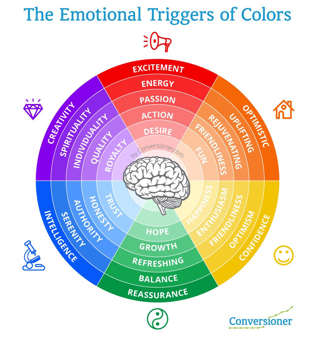
Color psychology is important in your content marketing. You can actually lose customers if the color scheme that you have chosen does not work well. So be sure to approach the colors that you use mindfully. First off, are you consistently using your brand colors so that it’s clear that your content is yours? And beyond your brand colors, think about the other colors that you’re using in your marketing. Do they appeal to your customers? Do they complement your brand colors?
You don’t have to go extreme and pick a wide range of colors to appeal to a wide range of emotions or audience segments. Just be consistent, and make sure that you’re reinforcing your brand personality and values. By keeping your color schemes minimal, they’ll be impactful and help your audience recognize your brand. The more consistent your designs are, the better people will engage with them.
Use infographics
Not all your customers will enjoy reading through blog posts even if the post is of high quality. Some people like to just look through images and understand things at a glance. Add to that the fact that people following instructions from a combination of text and illustrations actually do 323% better than those following just text.
This is why infographics are a great way to transform your content marketing using a design-led approach. And the content doesn’t have to be created from scratch. While you can create completely new content for your infographics, you can save a whole lot of time and resources by repurposing the existing content that you already have. For example, if you know that you have a really great blog post that explains a process very well, you can compress it into an infographic. A lot of brands have done just this and gained positive results and feedback for it.
A picture is worth a thousand words
In design led content marketing, images are certainly worth more than a thousand words. In a sea of content, videos, images and graphics make lasting impacts. To choose images that are highly engaging consider the following options:
- Show people using your product or service. This will help build customer trust in the brand as well, because it offers social proof.
- Demonstrate the benefits of your product or service. Give people proof through testimonials and reviews that those who bought what you have to offer, are experiencing a positive change in their life. This can take the form of static images and text or videos.
- Demonstrate the functionality of your product in a creative and innovative way. Just remember, the design needs to be able to capture the attention of the audience and hold it there.
- Show people clearly how your product or service will remove their pain points and help them overcome the challenges that they have.
Design-led content marketing will elevate your brand
High-quality designs coupled with great content will not only increase engagement and drive more traffic, it will also boost your SEO efforts. When you prioritize design, you create more opportunities for brand exposure and awareness. And you create value for your audience. It’s a real win-win. Of course, it does take consistent and sustained efforts to truly leverage. But with each and every piece of content you have designed, you’ll cement your brand’s place in your niche that much more.


