8 Tips For Creating Delicious Food Ad Designs
The food ad industry is a billion dollar industry, just in the USA alone. Given how the food industry is one of the major revenue generators across the world, you can understand the value of food ad designs.
Even on a personal level we all can agree that food ad designs excite us. Food has become a very commercial and social experience for all of us.

The pandemic has hit the hospitality industry quite severely. So, brands are leaving no stone unturned in ensuring they get the most attention from their customers.
Think about it. If we ask you to recount the top 10 ads in the past year, how many of these would be from the likes of McDonalds’ and Starbucks? More than one, if we are guessing right.
That is because brands and marketers know the value of advertising in the food industry, and spend a lot of time creating these food ad designs.
The necessity of food advertising is a reality for businesses of all scale and size. So whether you are a local business or a catering service, it is time to look at how your advertisements are performing.
The old saying we eat with our eyes first is completely true. Food presentation and design contributes heavily to customer experience. So if you work in this industry, you know that the same visuals are going to bring in the customers as well.
But how do you create delicious and enticing food ad designs? What is the secret?
Read this blog by Kimp to know everything you need to make your food ad designs get you a great ROI.
What does a great Food Ad design include?
Before we tell you how you can create the best food ad designs for your brand, let us define what that involves. Ideally, the perfect food ad design promotes your brand and makes everyone place an order instantly.
If you think that sounds too good to be true, we are here to tell you it is not.
Food Ad Designs can look as enticing as you want to be – and then some – by following a few simple rules.
1) Storyboarding
Yes, start by understanding how you actually want your food ad designs to look. What is the design style you expect? The layout? The color theme and the photos you wish to include? Now all of this can sound like a lot, and something you may struggle to communicate fully to your designer.
A simple mood board or storyboard can solve this for you. Analyzing your favorite food ads in recent times from your peers and competitors can tell you what you like and don’t like. And more importantly what works and doesnt. Compile a list of these and you are ready for the best design brief you have ever written.
Storyboarding also makes it easy for you to evaluate your food ad designs once they’ve been designed.
2) Product Photography
Now that we know storyboarding is important, let’s take a look at a few guidelines for some of the elements of your food ad designs.
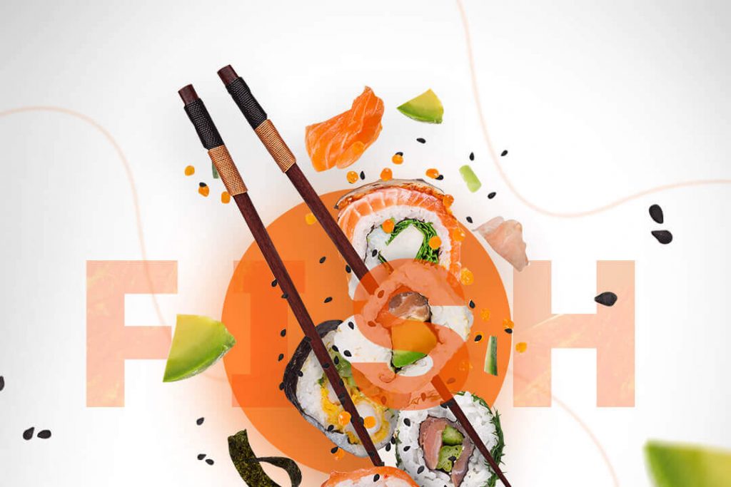
First and foremost on this list will be the product photography obviously. Customers like seeing actual images or images that closely represent the product you are pitching. You must also ensure that the product photo you pick brings out the best for the brand and the product.
Choose photos with dramatic elements and play with scale photography, macro modes, and include movement in the shots.
Remember the famous toss up shot of the McDonald’s burger that shows all the components? That’s one way to go, but feel free to explore our guide on product photography to choose the best one for your brand.
3) Branding
No food ad design is complete without branding. After all, that is the whole point of the food ad design right? You want customers to be able to interact positively with that advertisement and eventually bring in revenue. But how is that going to be possible if you do not actively brand your designs?
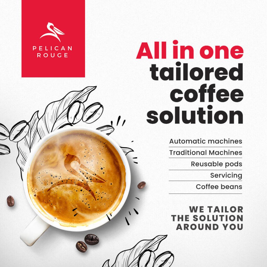
But the branding must be subtle and well-placed so that it is not that your logo is dominating the design. More so it should be that the colors, font, and design promote your visual identity. We often see designs wherein the branding does not extend beyond placing a logo and the brand name.
Branding an advertisement can be so much beyond and that is why we always recommend a brand style guide for a consistent look.
Looking to develop something similar for your brand? We’ve got you covered. With a Kimp Graphics subscription you get to work with a dedicated team that will get to know your brand and design according to your needs. All for a flat fee.
4) Colorful designs
Colorful designs and food are always a winning combination. Customers always like a colorful plate and we are sure that is where the saying eating with the eyes comes from. With such a powerful connection with the product, it only makes sense that the food ad designs feature color prominently.
Do not worry about being too experimental. Customers tend to view colorful food ads as being cheerful and adventurous, tipping the scales in your favor. As long as it matches your brand and product, take color for a spin in your food ad designs.
Fun Fact: The earliest Pop Art works created were of food products. So this industry is no stranger to color by any means.

5) Relevant Fonts
While fonts are not something we instantly connect with the food industry, they do have a huge impact on food ad designs. Consider this, if we mention an Italian pasta place, you have a certain font in mind, isn’t it? Flowy, loopy, and an almost script-ish font for the most part? Yes. And that is why font selection can make or break food ad designs.
Customers interpret a lot from your font choice – the product’s nature, the emotion you wish to convey, and the tone of the message in itself. So pick a font that ticks all the right boxes for your next food ad design.
6) Well-Placed CTA
Now you may consider this to be an obvious point. Yes, you need a CTA in your food ad designs and you probably have a great one in mind. The reason we are discussing this as one of the design elements is that customers perceive it to be so.
If you have a creatively done food ad design, but the CTA is just a couple of phrases in the bottom, chances are people will miss it. They are so busy looking at the brilliant design you have out there.
The era of having text CTAs at the bottom are gone. You must integrate the CTA into your designs using design techniques so that it looks natural and there is visual flow in the food ad design.
8 Tips for Creating Delicious Food Ad Design
So now you have a list of elements that every delicious food ad design needs. But is it that simple? There are at least hundreds of color combinations and countless fonts, not to mention the immeasurable options of logo placement. Needless to say, creating food ad designs need a little more detailed input.
In this section, Kimp brings you the top 8 tips that will help you create delicious, enticing, and engaging food ad designs for your brand. Everything you need to know for food advertising is right here.
So with no further ado, let’s dive right into it.
1) Spruce up the Food
We discussed in the previous section that product photos are a general fixture in all food ad designs. But the question still remains what kind of photos are your customers more likely to interact with? What’s the guideline to make a food ad salivating across mediums?
Well, while there are many ways to approach this, we bring you a few creative tips to get the ball rolling per se:
- Always use high quality product images in all your food ad designs. More often than not, it is the central element in the advertisement, so no compromises here. And when we say quality, we don’t mean the resolution alone. Factors like lighting, background, editing, and props play a major role too.
- Explore and experiment with different forms of product photography to pick the best one that suits the food ad designs. Always look for angles where the food can look its best.
- Capture images of the food or food products wherein you can highlight its natural color, texture, and form. Images with textures on fruits, vegetables, baked goods, or even pastas look highly attractive. This is because it gives off the feeling of being fresh which is a great selling point.
Kimp Tip : We understand that a lot of these become possible only with a high-end product photography crew. But you can possibly hustle your way into these hacks with a good editing team. Or a Kimp Graphics subscription which will help you get your designs done too.

2) Keep it Simple
Minimalism is the flavor of the season, hands down. And that is why we highly recommend keeping it simple in your food ad designs. At most, there must be two or three design elements. If you really want more than that, we recommend an infographic style so that visual flow and navigation becomes easier for the customers.
Some tips on adopting a simplistic design style is:
- Visuals >>>>> Text
We know the urge to write out all the best features of your products, reviews, and the offers you have on a single food ad design exists. But when you overcome it and substitute with images, it is then you have a lip-smacking design on your hands. - Leverage geometric patterns
Geometric patterns are very soothing to the eyes. And a lot of the food products are well into the geometric verse like cakes, pizza slices, pasta shapes, and so on. So leverage that connection and apply these patterns into your ad design to keep it simple and effective. - Negative space
Do not ever underestimate the power of negative space. It is the one design technique that can help you make the whole “less is more” concept come to life. Negative space in your design also gives breathing space to the other elements and allows customers to navigate easily.

3) Understand your Target Audience
Before we go any further and dissect the best and worst of each design element, you must understand how important understanding your audience is.
In terms of design style, there are innumerable approaches you can take. And how will you make the decision? By understanding your target audience and then matching that with the design styles your industry favors.
Older generation customers expect their food ad designs to be more conventional. And if that is your target audience, you can adopt a retro or vintage design style. For the millennials and GenZ, color pop, pop art, and minimalistic styles create a better impact.
This applies to people with different preferences as well. For example, a customer expects a different food ad design from a vegan brand than a steak brand.
So knowing your target audience makes choosing the design style much easier.
Kimp Tip: We understand that beyond the audience you have a vision for your brand’s food advertising efforts too. And that is why we recommend experimenting until you strike the right balance in your food and designs. Sound expensive? It doesn’t have to be. Design subscriptions like Kimp Graphics and Kimp Video are available for a flat fee.
4) Custom Illustrations
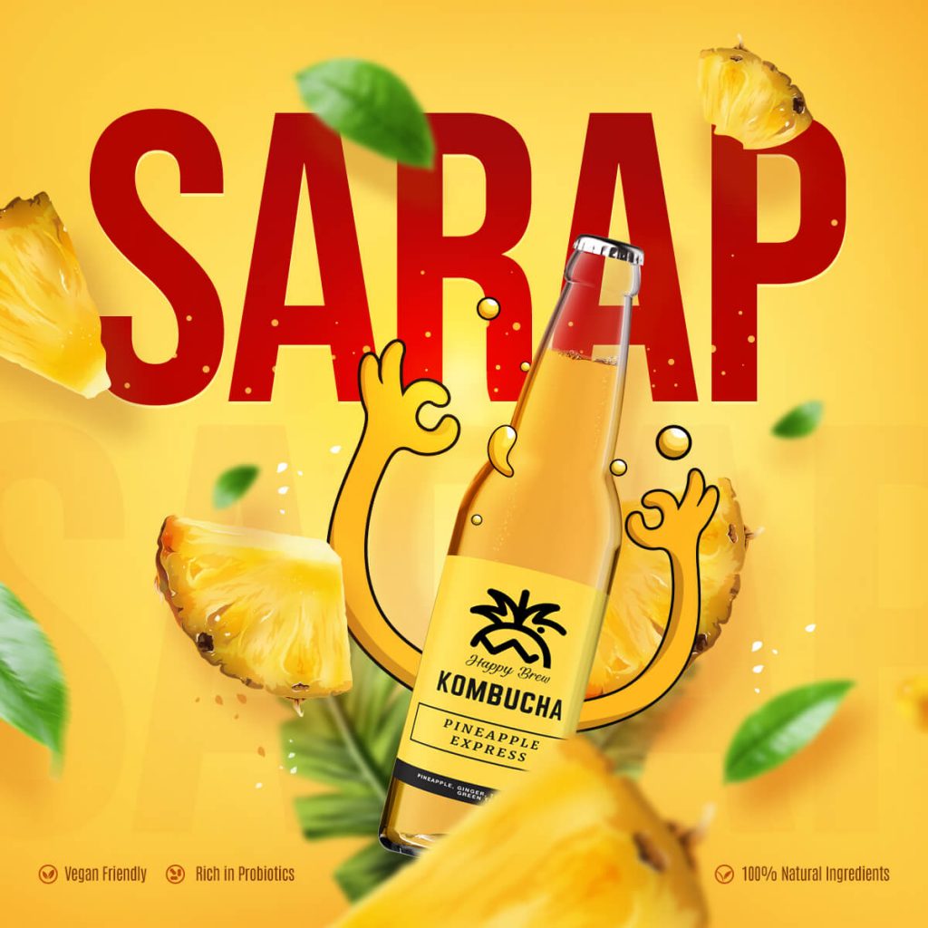
Have you heard of Kawaii? It is huge in Japanese design. Kawaii is the culture of giving cute attributes to inanimate objects, especially food products. Imagine a soda can with legs or a sushi roll with eyes. Now, this phenomenon of bringing products to life is now a worldwide preference especially in the food industry.
And the best way to achieve this is to include elements of illustrative designs in your food advertisements. Custom illustrations in the food sector can help you elevate the attractiveness of your product without going through the hassles of photography.
It also sets you apart from the other players in the market. How different can one burger’s photo be from the other? But custom illustrations can make it completely unique and help you win this game with ease.
Are you wondering how to fit custom illustrations in your advertising budget? What if we told you that you don’t have to spend an extra dime? Yes, Kimp Graphics’ unlimited graphic design service includes illustrations too for one flat monthly fee.

5) Make it Move
The success of videos on social media has shown us that customers like objects in motion more than those that are not. So if you are looking for a food ad design that generates a lot of interest, then we repeat – make it move!
Some of our best suggestions in this area would be to:
- Create video ads for Social Media as much as possible. Video ads on Facebook, Instagram, and Twitter have a higher ROI because customers like them so much. Food is a very visual product and video helps you feature textures, sounds, and the actual experience much better than an image.
- Videos look too expensive? How about investing in GIFs – the highest shared content on the internet. Creating food ad designs in this format can make you go viral without spending a lot on quality renders and long videos.
- Looking for ideas without recording? Well, thankfully, animated videos are widely popular in the food advertising industry.
Looking for a design team that can handle animation, GIFs, and videos at a reasonable price? Check out the Kimp Video subscription.
6) Keep it Real
Gen Z and Millenials are constantly on the lookout for brands that are honest, straightforward, and mean what they say. They also make up for the biggest customer base worldwide. So the old rules are out the window. Gone are the days when only final, polished products got to be on the ad design.
In the pandemic, there is a lot of concern about cleanliness and hygiene, especially for the food industry. With an unpolished and unabashedly real food ad, you can address those areas.
To attract a honest and more straightforward clientele,
- Create a food ad that celebrates your kitchen staff, vendors, and even customers while showcasing your values. A BTS video works great for that.
- Show a sneak peek of your creation process to bring the customers a step closer to your products and form an emotional bond.
Kimp Tip: Video ads work the best for process videos and BTS too. But the key is to keep it short, breezy, and light-hearted. The choice of clips and audio makes a great impact here. Work with your design team to discuss the production side before you begin shooting.
7) Visual Hierarchy
The principles of visual hierarchy tell us that you can actually determine the path a customer takes in your design. Yes, you can decide what they see first – the headline, CTA, the image, or any other element. This can be achieved this with strategic placement, varying font styles, and leverage color for division in the layout.
If you get this right, you will be able to customize the user experience to the last glance and you never have to worry if they noticed an element or not.
Visual Hierarchy uses:
- Imagery
- Color
- Font
- Layout style, and more
That is why we recommend opting for a simplistic and clearly defined food ad design because nothing gets lost.

8) Social Proof
We all know why Yelp and other review platforms are so awesome right? Because they allow people to know about a particular establishment from actual customers. So that they can make an informed decision. What if you could leverage this particular feature for your food ad designs too?
How great will it look if the picture of your best product, say seafood platter, features a review from a customer who enjoyed it a lot? That is what we call using social proof to advocate for your product and brand.
Social proof goes beyond just sharing reviews alongside product images:
- You can repost a user-generated video/content about your service in your food ads with a little editing and branding to match your brand style guide. Keep the content the same but spruce it up a little.
- Share the ratings your establishment has on various platforms to demonstrate your credibility.
Create Stunning Food Ad Designs with Kimp
Food advertising is a huge industry. So the competition is also going to be intense. Not to mention it spans many different types of businesses – restaurants, caterers, grocery stores, wellness brands and more.
If there is one way for you to keep your head high in all this commotion, it is definitely by leveraging the power of design. When you are dealing with a visual product like food, you need a great design team. A team that can make your product look its best in all instances.
And that is exactly what you’ll get with a Kimp Graphics or Kimp Video subscription.
We offer the services of our expert designer across a ton of different categories of graphic and video design, unlimited design requests, revisions, user profiles and more.
So why wait? Sign up for the free trial now and get creating now.
