
The Paradox of Choice in Marketing: Moving Beyond Choice Overload
Picture this: You’re at the supermarket to buy cereal. But then you hit the aisle and feel overwhelmed by the abundance of options in front of you. Part of you wants to grab a familiar box and get out of there. Another whispers: “What if there’s a better one?” Suddenly, a quick cereal run turns into a 30-minute analysis paralysis session. This internal battle between abundance and indecisiveness is the paradox of choice.

It’s not just a cereal aisle phenomenon; it’s a major hurdle for businesses everywhere. You might have crafted the most persuasive marketing materials, but if your customers are bombarded with too many options, they might freeze up and abandon their buying journey.
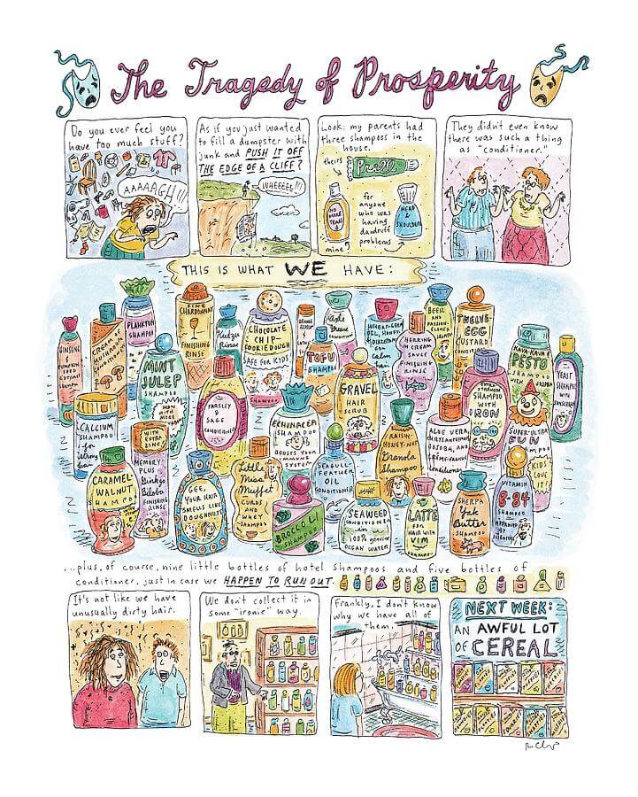
The “Tragedy of Prosperity” poster by Roz Chast perfectly captures the overwhelmed modern consumer drowning in a sea of choices.
The paradox of choice is a crucial term for marketers and entrepreneurs to ponder over. Because it can creep into your product offerings, the features you pack into your apps, the amount of customization you allow, and even the number of options you present in your marketing calls to action.
Sound intriguing? Buckle up! We’re going to take a deep dive into the paradox of choice in this blog.
Understanding the Paradox of Choice
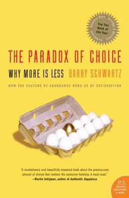
Back in 2004, psychologist Barry Schwartz popularized the term “paradox of choice” in his book, “The Paradox of Choice: Why More Is Less” The core idea? An abundance of options can actually hinder decision-making and satisfaction. This might seem counterintuitive but recall our cereal run example.
Businesses often fall into the trap of thinking more options equals happier customers. They see it as giving customers control, putting them in the “driver’s seat.” But have you ever driven on a road that forks in a million directions, leaving you paralyzed by indecision? Even Google Maps can’t always save you from that mini-panic attack!
Think of it like staring at a packed closet, overwhelmed by options, unable to decide what to wear. Is that the shopping experience you want to create for your customers? If navigating your brand feels that stressful, will they come back for more? Probably not!
But it’s not just the concept of the paradox of choice that continues to highlight how less is more in marketing. The phenomenon of decision fatigue or even the principle of Hick’s Law all lead to similar perspectives. Let’s quickly compare how each of these connects back to the idea of minimizing your options to maximize your outcomes.
Decision Fatigue & Paradox of Choice
Data shows that an average adult makes about 33,000 to 35,000 decisions each day. From what time to wake up, what to wear, what coffee to brew, and which route to take to work. Each choice, while seemingly insignificant, contributes to a phenomenon known as decision fatigue.

Evidently, decision fatigue and the paradox of choice are intricately linked. Decision fatigue stems from the time it takes to evaluate options, as dictated by Hick’s Law (discussed later). This fatigue then fuels the paradox of choice, making it harder to find a satisfactory option and leading to potential regret.
Therefore, if you do not consider the paradox of choice in marketing your brand, then you are creating:
- Overwhelm that makes it tough to make a decision.
- Dissatisfaction because consumers start wondering if they made the right choice.
This is why brands that eliminate the paradox of choice and ensure that customers are not bogged down by decision fatigue often end up making consistent progress.
Take the popular footwear brand Crocs for example. They do not offer endless choices like other footwear brands. However, they have witnessed steady growth these past few years with their annual revenue reaching about 3.96 billion U.S. dollars in 2023. Part of the reason is because they do not intimidate their consumers with too many options to compare.
Hick’s Law & Paradox of Choice
Formulated by American psychologists William Edmund Hick and Ray Hyman, Hick’s Law found that the time taken to make a decision increases when the number of choices increases.
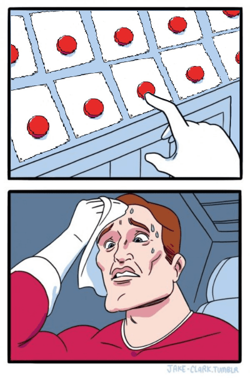
Hick’s Law applied to marketing means that you are increasing the time it takes for customers to make a decision and proceed to a purchase when you present them with too many options. However, a majority of shoppers (about 80% of them) prefer getting shopping done as quickly as possible. Therefore, your aim is to reduce the time it takes. And one way to do that according to Hick’s Law is to reduce the number of choices.
While they take different approaches, both Hick’s Law and the paradox of choice share a common goal: explaining how excessive options can negatively impact decision-making.
With the nitty gritty addressed, let’s move on to some actual examples in the business world in order to understand how brands handle the paradox of choice. There are some that have learned from their mistake of offering too many options and addressed the challenges in their own creative ways. And there are others who have found a way to work around the hurdles and still offer an abundance of choices to their consumers.
Tips & Takeaways From Brands That Beat the Paradox
1. Netflix and their endless content options
While the paradox of choice and decision fatigue are very real, we cannot deny the fact that brands like Netflix need to keep expanding their offerings in order to stay ahead of their game. So, how do they tackle the struggle of choice overload?
Remember the Play Something feature they introduced a while ago? This was introduced to tackle the challenge of binge-scrolling without actually finding anything to watch. This feature was designed to suggest random content to eliminate decision fatigue.
Unfortunately, this feature was discontinued, but it highlighted their awareness of the paradox of choice. However, Netflix continues to fight overwhelm through personalized recommendations. By analyzing your viewing habits and preferences, Netflix curates “Recommended for You” rows and “Because you watched…” suggestions.
KIMP Tip: Creating a sea of content is not enough. The variety only overwhelms users. Instead, focus on personalization so as to improve the relevance of content delivered to individual users.
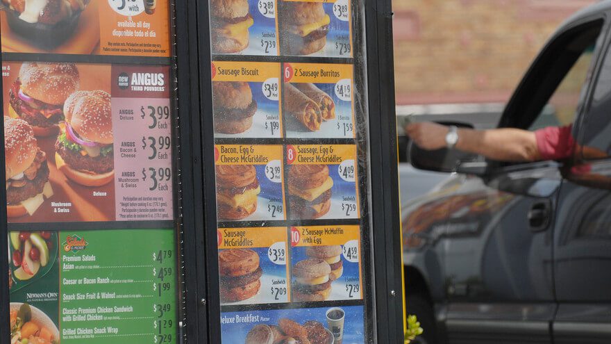
2. McDonald’s and their menu simplification decisions
Data shows that 3 in 10 Americans have menu anxiety. One of the reasons behind this is too many options on the menu. Hence several fast-food brands like McDonald’s have chosen to simplify their menu over the years.
McDonald’s underwent a major menu simplification in 2015 when the sales in several of their restaurants started declining. Reportedly, too many options also meant an increase in service times. To tackle this they removed several underperforming menu items from the display, streamlining the selection and focusing on core offerings.
3. Oreo defying the paradox of choice like a pro
While countless articles have explored the pitfalls of excessive options, Oreo keeps churning out new and often bizarre flavor combinations. So, if the paradox of choice is a real thing in marketing, how does Oreo manage to stand out despite continuously expanding their options?
Firstly, several of Oreo’s new flavors are limited-edition releases. Hence they create a sense of scarcity and excitement. This approach prevents customers from feeling overwhelmed by a vast selection, while still offering a taste of novelty.
Secondly, they win through playful experimentation. Think Root Beer Float, Swedish Fish and Wasabi! This creative exploration keeps the brand relevant and generates buzz, even if some flavors are short-lived. Moreover, this creates a sense of fun and discovery, potentially attracting new customers curious to try the latest outlandish offering. No wonder, they have won the hearts of GenZers with about 83% of them snacking on cookies reportedly choosing Oreo.
Too many OREO Cookie flavors? It’s called having range 💅
— OREO Cookie (@Oreo) April 8, 2022
KIMP Tip: When you have plenty of great ideas for your brand and yet you do not want to struggle with the paradox of choice, consider offering new products as limited editions to evoke excitement. Furthermore, stay playful to keep the excitement alive, as long as it does not dilute your brand!
4. Cheesecake Factory balances customer experience and variety
The Cheesecake Factory is known for its sprawling menu. Well, this might seem like the antithesis of tackling the paradox of choice. However, their approach offers a unique perspective on balancing variety with customer experience.
Did you know that the restaurant once started with just 26 items on the menu? Fast forward to 2023, there were over 250 items on the menu. In fact, their long menu is one of the signature elements of the brand today. When we talk about the paradox of choice hampering customer experience how did Cheesecake Factory manage to stay in the game while consistently expanding their offerings?
According to David Overton, the founder and former CEO of The Cheesecake Factory, they update the menu twice each year and they have been doing so for the past 40 years. This helps keep their menu current. Besides, customers always have something new to look forward to. This consistent improvement preserves the excitement and helps the brand stay ahead.
We're the Cheesecake Factory. Ofc we have new menu items 💁♀️ pic.twitter.com/mjWdODtlrL
— The Cheesecake Factory 🍰 (@Cheesecake) March 8, 2024
Additionally, they focus on the other aspects of their brand like their restaurant ambiance, for example, to create a memorable experience for their customers. Deep dark booths, oversized portions, and theatrical desserts contribute to a sense of indulgence. And amidst this, their vast menu fits seamlessly.

Now that we’ve explored how various brands have tackled the paradox of choice in their product offerings and strategies, let’s dig a little further. Because the impact of choice overload goes beyond physical products and store shelves. Marketers also need to consider how the way they present information can influence customer decision-making.
Taming the Paradox of Choice for Your Marketing Collateral
1. Avoid information overload on your website homepage
Your website homepage is often the first virtual handshake with your potential customers. Therefore, keep the paradox of choice in mind and create a page that does not bombard your visitors with excess information.
For example, what do you think of the below homepage? While there is nothing gravely wrong with the design on the whole, there is one little thing that might be a turn-off for website visitors. Too many navigation items on the menu.
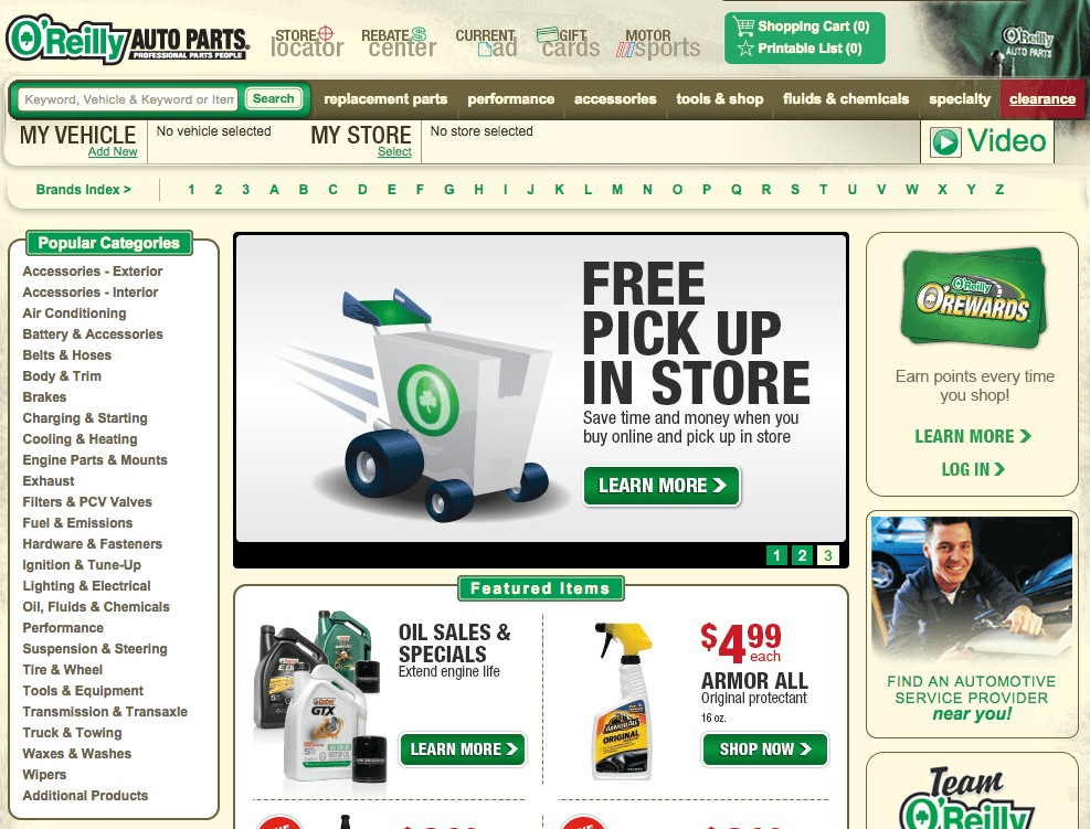
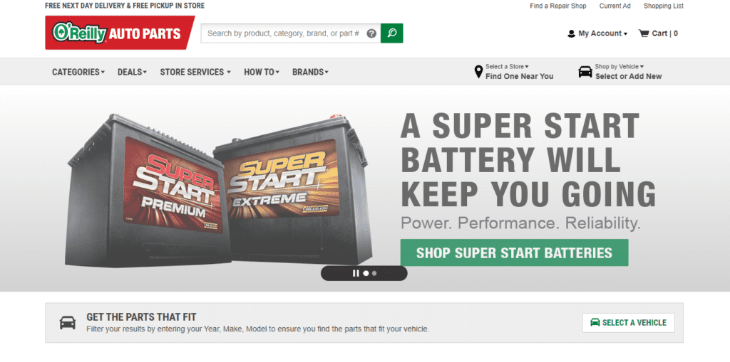
This is a clear example of how the paradox of choice can affect user experience in web design. The above company now has a refreshed website which looks sleeker and much more user-friendly thanks to the fewer links and a more organized layout.
Need help with website design? Get a KIMP Graphics subscription!
2. Limit CTAs in your marketing designs
CTA or call-to-action is undeniably one of the most crucial elements in any marketing design. However, having too many CTAs can be a problem. Since multiple CTAs mean multiple options leading to decision fatigue. Instead, a clear-cut path for customers to take ensures that they move to the next step confidently.
Data shows that marketing emails with single CTAs tend to increase sales by about 1617%. Because with a concise email that contains information streamlined to lead to a single well-defined CTA, it becomes easier for customers to make a decision. This is a classic example of creating marketing collateral accommodating the implications of the paradox of choice.
Take the below email from Home Depot for example. While the email does a good job of promoting the offers in focus, multiple generic CTAs like this one end up confusing users. There is a good chance that they scroll through the content and leave without progressing to the next stage in the sales funnel.
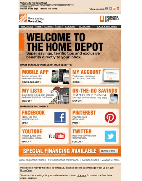
Instead of overwhelming your customers with several CTAs as in the above example, identify the most relevant call-to-action and seamlessly incorporate it into the design.
3. Prioritize visual hierarchy
When there is an abundance of information, choices, and details to explore, and there is no option to skip any of them, the key is to define clear priorities.
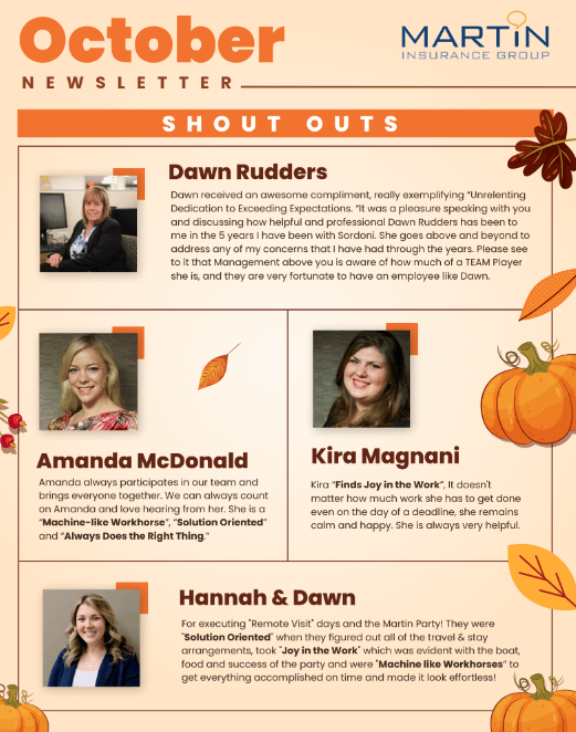
For example, take marketing newsletters. They are meant to be informative. Often they provide quick bite-sized updates. Therefore you might have a lot of information, long lines of text, and visuals going into them. In such cases, you need to find a workaround to defy the paradox of choice and convince users to digest all the details presented.
In such cases, use design elements like headings, subheadings, bullet points, and clear visuals to guide the user’s eye and create a clear hierarchy. You also need organized layouts as you can see in the below design.
Remember, Less is More
In summary, we’ve seen how the paradox of choice can impact customer behavior, from product selection to website navigation. Understanding this concept helps marketers create user experiences that are clear, and concise.
This translates to a more positive customer experience, better engagement, and finally, higher conversion rates. But what if you don’t have the time or resources to create these user-centric marketing materials yourself? That’s where an unlimited design subscription like KIMP can be your cost-effective way to create customer-focused marketing designs for your brand – from website design to social media graphics and beyond.
Ready to experience the power of unlimited design subscriptions? Register now for a free 7-day trial!