LinkedIn Ads: How To Design Clickable Ads For Your Brand
Every social media platform has its charm, doesn’t it? Facebook has become mostly about connecting with old friends, participating in niche groups, while Instagram is an entertainment and shopping app today.

And LinkedIn? Well, LinkedIn is the world’s largest professional social media platform. What started as a platform for people to speak about their jobs, careers, and look for opportunities has evolved into much beyond that.
Today, it is the number one lead generation platform for B2B and B2C companies. And it is also home to some of the most accomplished minds worldwide.
That makes it an ideal platform to advertise on.
When you advertise on LinkedIn, you connect with customers that are ready to take action and with the intent and power to transact with you.
LinkedIn Ads are a tad bit different from other typical social media platforms, so here is a guide by Kimp to help you navigate them.
Let’s get started.
LinkedIn Advertising
LinkedIn Advertising’s fame in the marketing circle is largely because of its revolutionary impact on the B2B segment. We all know how hard B2B sales can be. There are too many levels and hoops to jump through. But, the last few years have shown us that effective content marketing can ease those struggles a bit.
What can ease it more? Advertising on LinkedIn. Yes, we mean it. In fact, it is the leading platform used by B2B marketers, much ahead of Twitter, Facebook, and YouTube in this race.
And if it can crack B2B, be sure that B2C marketers are huge fans too.
But if you look at its user data, LinkedIn has a little over 774 million members while Facebook has close to 3 billion. So what makes LinkedIn so popular? Well, because 4 out of 5 LinkedIn members are decision-makers with 2x the buying power of other social media audiences.
It is a platform that boasts that 97% of Fortune 500 members are users.
These numbers are a few reasons why LinkedIn is becoming the most trusted platform by everyone and why its advertising revenue surpassed $1 billion in 2021’s third quarter.
While this all sounds good, we know the cost of LinkedIn ads is worrying you. LinkedIn ads’ average cost per click is close to $5.26, while Facebook’s cost per click is $0.97. This is a huge difference.
But LinkedIn’s targeting, account-based marketing features, and retargeting metrics can help you make a higher revenue here, especially for B2B marketing.
So if that’s what you want, let’s dive in and learn about LinkedIn ads.
LinkedIn Ads: Design for your business goals
We all know the importance of segregating your advertising campaigns based on objective and customer journey. Not every customer is looking for the same information, so an advertising platform that supports this model is what every marketer is looking for.
LinkedIn Ads allow you to pick the objective as per your marketing campaign goals. Before you design LinkedIn Ads and discuss the options available, let’s take a look at these objectives.
Choosing the right objective is very important to ensure your campaign’s success. So understand your target audience, campaign objective, and pick the right ad goal for your LinkedIn ads.
1. Brand Awareness
Are you a brand only looking to spread the word about your business, product, or service right now? Well, then this objective is what you need.
So what can you achieve via these brand awareness ads?
Right off the bat, the aim here must be to form a good impression of the brand. You can feature your products, services, or brand story to do that. Pick the format based on the content you are featuring.
Typical results here are increased follower count, higher views on content, and increased engagement in the ad itself.

2. Consideration
Next comes the consideration stage. Here, the marketing objective is to detail the features, benefits, and value of your product/service. This is the lead generation stage and the time to get into details.
Ensure that your ads celebrate the product prominently and can grab the scrolling user’s attention in a jiffy.
Common results are website visits, landing page clicks, video views, higher engagement across the platform, and so on.
You can choose popular formats such as video ads, carousel ads, single image ads, or promote well-performing content via the sponsored ad format.

3. Conversion
Next up is the final stage of all. We are, of course, talking about the conversion stage of the customer journey. The customer knows about your brand, has perused your content, and is on the last stage of all – finally clicking the buy button.
LinkedIn Ads can come to your aid in this stage as well. For this stage, you can feature reviews, testimonials, product benefits, and other content you think will cinch this deal for the customer.
The objective here is to generate traffic to a product page, ecommerce store, shopping page, or sign up for a service. You can use formats that allow you to divert your customers to a dedicated landing page, ecommerce store, job application form, and so on.
Now that we know what goals you can design LinkedIn Ads for, let’s explore the most popular formats of LinkedIn Ads for brands.

LinkedIn Ad Types + Design Tips
LinkedIn Ads works for recruiters, marketers, and brands looking to connect with customers and employees. Based on the message, campaign objective, and result you are planning to drive, you can pick any of the LinkedIn Ad types we describe below.
This section will tell you all you need to know about each ad type and design tips to watch out for to successfully implement them.
1. Single Image LinkedIn Ad
We all know that a picture speaks a thousand words, especially in marketing. People on social media platforms are busy, easily distracted, and looking for the best content to give their attention to.
In such cases, using image-based ads instead of text can be extremely helpful for a brand. Hence, enter the Single Image format in LinkedIn Ads. They appear like any other image-based content on LinkedIn feeds but have a “Sponsored” tag to differentiate them from organic content.
You can only feature a single image in this ad format, and it can be in the jpg, png, or gif format. It is possible to drive clicks from this ad on LinkedIn to any link that you wish to.
Common orientations for this ad are horizontal, vertical, and square. We recommend horizontal ads above the other formats since the others may appear cropped in some views.
Single image ads work for almost all goals right from brand awareness, website visits, and engagement increase.

Kimp Tip: Single image ads are best to drive awareness or promote a singular event, product, or service that you want customers to notice. For best results, keep the caption and heading to a minimum and let the image do its work.
Looking for a team to design that perfect image for your brand? Look no further than Kimp Graphics. Book a call with the team today!

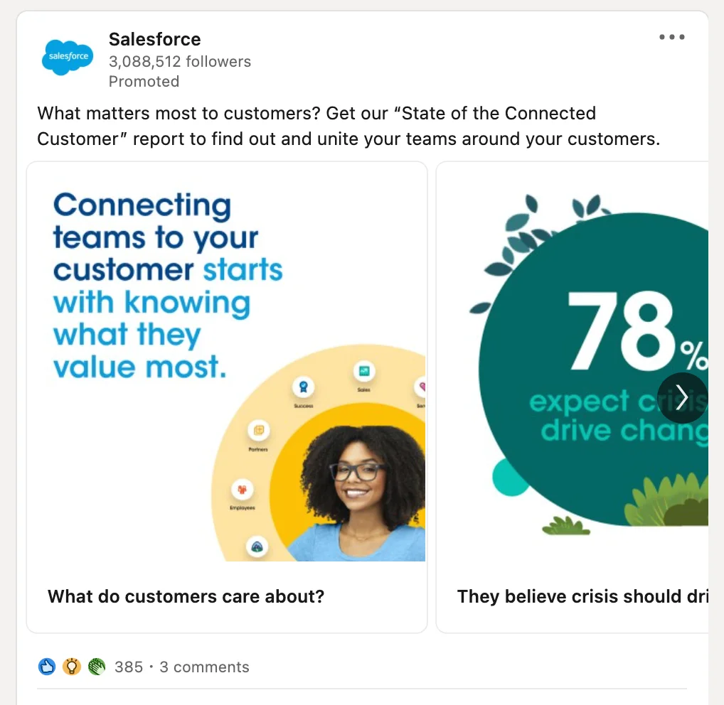
2. Carousel LinkedIn Ads
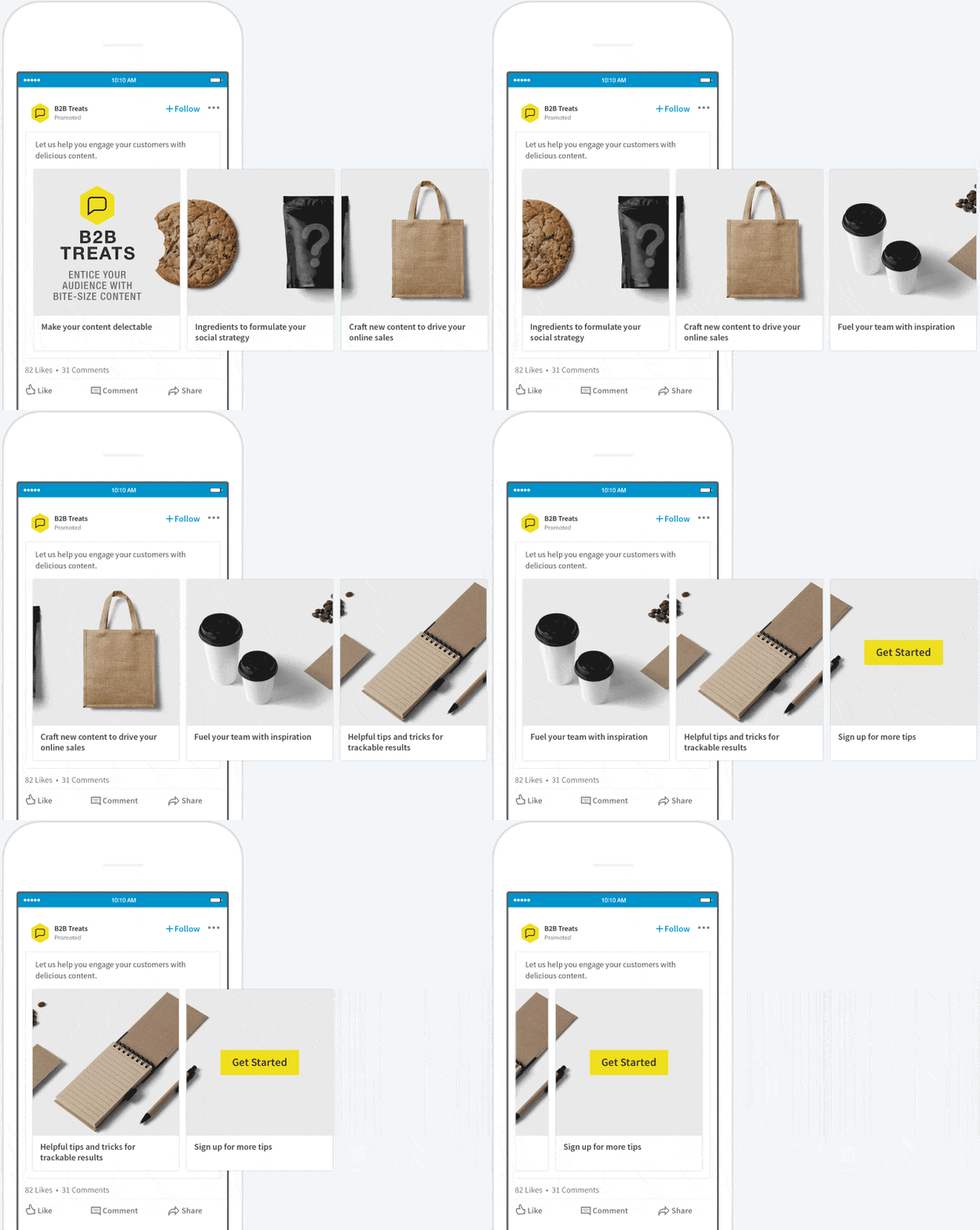
If you have a story to tell, need space to describe a product in detail, or showcase reviews, then a single image won’t do. And that is when you use Carousel ads on LinkedIn. Carousel ads allow you to upload two to ten cards to promote your product or service on the platform.
Carousel ads can help you divert your clicks to a website, landing page, ecommerce store, or lead generation form based on your campaign goal.
While you are free to pick any orientation for your carousel ads, the platform recommends square images here for the best viewing experience. Like single image ads, this ad format also supports jpg, png, and static gif formats.
So what works best on Carousel ads?
Well, brevity is your friend here. Even though you can upload up to ten cards, stick to 3-5 cards to attract the customers’ attention and incentivize them to click on your CTA. Anything beyond 3-5 cards is too long, and you may end up falling prey to the scrolling thumb.

Kimp Tip: Storytelling is an art, and for LinkedIn Ads, carousel ads are your medium for that art. Position your cards for maximum impact. Start with an attention-grabbing headline and image, building up the story with the final CTA at the last card.
Your success in carousel ads relies on how well you tell the story.
And if you want help in visualizing that story, the Kimp Graphics subscription is just a click away.
3. Video LinkedIn Ads
We know well-designed images are completely amazing. Of course, they do a better job at conveying a message than text hands down. But, sometimes a story needs something more than a series of swipeable images. And that is when you bring out the big guns and enter the realm of video ads on LinkedIn.
Video content is widely popular on social media, and 88% of marketers agree it turns out a positive ROI consistently. On LinkedIn specifically, video consumption is growing, and consumers are spending 3x more time on videos than images, with 30% higher engagement via comments.
LinkedIn supports video ads up to 30 minutes, but we recommend that like all other platforms, it is best to keep it short. LinkedIn recommends a video length of 15 seconds long, but anything less than a minute works well.
You can choose a landscape, vertical, or square orientation based on the video design. However, the vertical videos only run on advanced versions of Android and iOS.
Kimp Tip: Your videos must have captions, an attractive thumbnail, and a complete attention-grabbing beginning for the campaign to generate views and leads. The first few seconds of a video are the most important so ensure you put your best foot forward. Include the value proposition, benefit, and problem statement right off the bat.
Video can bring you results on LinkedIn Ads if you get them right. If you need a team to deliver exceptional video ads for your campaigns, try Kimp Video today!
4. Sponsored Content on LinkedIn
What we just saw until now are what we call direct sponsored content for LinkedIn Ads. These content pieces are not available on any company page or profile until you publish them as ads. On the contrary, sponsored content is a format of LinkedIn Ad wherein a brand boosts a well-performing content piece they have previously published.
So what types of posts perform well on LinkedIn?
- Studies tell us that posts containing images have a 98% better comment rate than those without.
- Also, educational content that helps the audience is a huge win. 1 in 5 investors agrees LinkedIn is a place to learn new content.
Promote your product with visual aids to reach the 65 million decision-makers on the platform.
Create meaningful, engaging, and informative content on LinkedIn so that you can boost later for your ad campaigns.
LinkedIn Ad Design Tips for Clickable Ads + Examples
As you may have noticed in the previous section, most common ad formats use visual aids and rely on the design’s effectiveness for their success. So if you want your LinkedIn ads to succeed and bring you the ROI you are looking for, you need to nail the design.
Wondering how to do that? Not to worry, Kimp brings you the best design tips for LinkedIn Ads with examples. Let’s get into it.
1. Visualize your offering
The average time a user spends on LinkedIn is seven and a half minutes per session. This means that you have very limited time on your hands to grab your customer’s attention and convince them to interact.
You can overcome this obstacle with visual aids that make comprehension and recall easier. We remember images longer than text and our brain also reads images faster. Social media, in particular, is a highly visual medium, and LinkedIn is no exception.
So, this is your cue to include graphic design aids to explain your concept instead of text.
Show instead of telling, and you can win over your audience quickly.

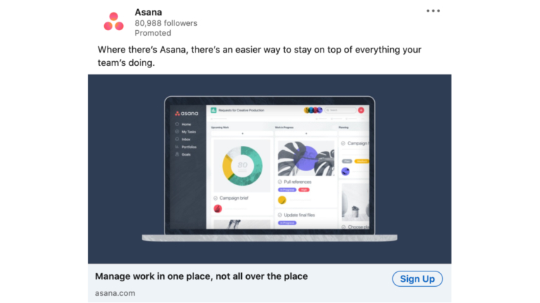
What is common in this very attractive example of a LinkedIn Ad design? This brand took the route of showing an actual snapshot of its products and features instead of talking about it.
Kimp Tip: Design custom images that best bring out the value of your product or service for maximum impact on LinkedIn Ads. This can help you drive clicks even with single image ads.
Need help with your designs? Connect with Kimp Graphics for all your design requirements today!
2. Pick the right colors
We can never speak about the importance of color in marketing enough. Color can make or break a design. Your LinkedIn Ad creatives are no exception to this universal rule. Our brain connects colors with specific emotions, and if you want your customer to connect instantly with your ad, pick the right color.
Brands usually end up picking their brand colors to build recall and make it easier for the customers to understand the ad. You can definitely choose this option, provided it fits your context. If not, you can choose any color that fits the context based on color psychology principles.
Since the LinkedIn platform is also text-heavy, you can use bright colors in your ad designs to stand out instantly on your customer’s feeds.


Kimp Tip: Dark mode is quite popular on LinkedIn, so ensure you make your designs and color selection compatible with this feature.
3. Mobile Optimization
57% of all LinkedIn traffic is from mobile, and that is a huge number. You would be highly remiss if you do not optimize all your LinkedIn Ads for the optimum viewing experience from a mobile device.
As we have seen in the previous sections, LinkedIn has specific orientations that they recommend for each ad type. Some of these orientations may not work well on mobile, so it is best to test your ads for mobile experience before you go live.
In case you think that a landscape or horizontal orientation works the best for your ads, then ensure you have enough margins so that the mobile experience is good.

4. CTA positioning
Ultimately, you need customers to engage with your ads and click on your CTAs. So the positioning and design of your CTA links are naturally very important. Based on the objective you choose, LinkedIn Ads will allow you to pick the CTA such as Sign up now, Click here, and so on.
But you can always include the CTA in your ad creatives itself as well. The in-ad CTA can guide customers on what action they must take if they like your message.
In carousel ads, we recommend you keep the CTA to the end so that the customers swipe through all the cards. In video ads, you can include the CTA section at the bottom of the screen so that even if they do not watch it to the end, they can click on the link.

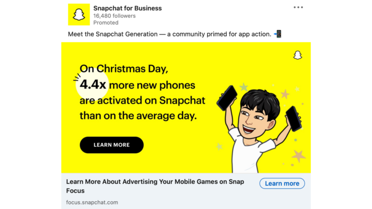
In this example, Snapchat has featured the Learn more CTA prominently in the design besides the default available in the ad. This way, the intention is clear, and the customer’s eye is tuned to click.
Design Clickable LinkedIn Ads with Kimp
LinkedIn advertising is the best investment you can make to grow your business. The audience on the platform is incredible and can change the course of your company.
Yes, we know it is expensive. But if you have the right design and target it well, the ROI will be beyond your dreams. And if you are a B2B company, this is an easy decision. You need LinkedIn advertising in your strategy.
Looking for a team to support you with the best designs as you embark on this journey?
Kimp Graphics and Kimp Video are right here for you. Our flat monthly fee subscription plans offer unlimited designs, revisions, and an expert team that can cater to over a hundred categories.
All you need for the best LinkedIn ads under one roof.
So why wait? Sign up for the free trial now.


