Get Inspired With These 2021 Logo Design Trends
When 2020 rolled around there was much excitement for the start of a new decade and all that would come with it. But it goes without saying that we’re all too happy to leave it behind and look ahead to 2021. This includes looking ahead to 2021 logo design trends.

Whether you’re a new business or one looking to put a fresh new twist on an old style, we’ve got some ideas for you.
Your logo is one of the most important components of your brand. And it plays a huge role in generating and reinforcing brand awareness. As we look ahead to what’s expected to appear in the world of logo design in 2021, there are many themes and trends that are coming in from all around the world. And they are certainly very creative.
It is also clear that these trends were born out of the need to reinvent and innovate without restraint. 2020 has been defined by the extent to which all of our lives have been subject to constraints, and we see the hopes of breaking through in the 2021 logo design trends.
2021 logo design trends you need to know
Going 3D and Isometric
If you want to add more depth to your logo 2021 will be the perfect year to do so. Even if you already have a logo, adding in some shading, shadows and highlights can help you transform it into a design that is modern and cutting edge. There is a lot of variety that you can bring into your branding with this trend.
Keeping things simple
Logos have consistently become simpler with time and this is a trend that is expected to continue throughout 2021. Businesses are using digital tools increasingly to communicate with their customers, and this requires simplicity in branding and minimal graphics. The use of intricate patterns in logos and overly complex fonts is being dropped in favor of simplification.
Give animation a try
We are used to seeing a static image of a logo. No matter the placement or medium we expect to be static. But animations have become an integral part of visual advertising over the past few years – especially micro-animations. And with new channels and mediums through which brands are representing themselves, this trend is seen as becoming even more popular.
It doesn’t even need to be anything overly elaborate. Just think of the simplicity of the Pixar logo’s animation. A simple animation that makes the logo memorable and gets the brand’s innovative, imaginative personality across.
While static logos only capture a viewer’s attention for up to 3 seconds, animated logos are much more engaging. As a result they create opportunities to leave a more lasting impression.
With social media allowing you to really experiment, animated logos will help businesses push their boundaries in 2021.
Use ink styles
This is expected to be one of the most intriguing 2021 logo design trends for creative brands. It will feature complicated and hatched lines as well as incredible details. Ink style logos will range widely from stylized signatures to very graphic imagery.
These are the kinds of logos that will compel the customer to take a step back and admire the artwork of the brand. There is a combination of hand-drawn characters, along with impeccable attention to detail, high quality, and a lot of individuality that will give the logo an air of being an absolute winner. They are expected to be head turners that are very sophisticated.
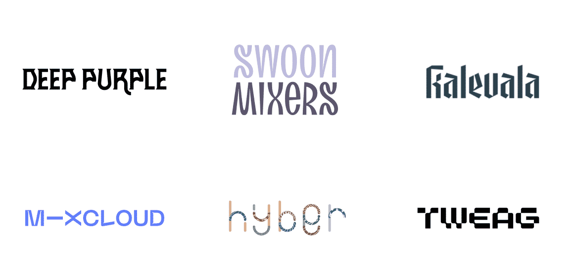
Try unique typography
Building on the trend of using ink styles, if your brand has a logo that is text based, try creative typography. Just like choosing the right colors, the right fonts can really get your brand’s personality across. Your audience will also remember your logo more easily because of the fact that it is unique. Just remember, you can’t compromise readability for that cool-factor. It would defeat the purpose of having such an interesting font in your logo, if people were not able to read it at all.
If you’re thinking about doing a logo refresh, and already have a text-based logo, try a different font or even a different weight of the same font.
Go asymmetrical
Many brands conventionally play it safe when they design their logos, and paint the lines that make it flawlessly. They’ll try to have their design fall inside a very strict grid. However, 2021 seems to be the year where designers are called to ignore these rules and push the boundaries as much as they possibly can.
Abstract illustrations seem to be trending again and so, it is making the way for more creativity. Many artists will confirm that it is in fact absolutely necessary to maintain asymmetry when they are drawing objects. This approach to designing will make the object look more natural and lively. This is also probably why there is a lot of attention that is being given to free design, alongside free composition. When designers place the elements of a logo with a more asymmetrical effect, the design automatically becomes more unique.
Get inspired by nature

Nature has always been a component of many logos. Especially for brands that promote active lifestyles or have a tie-in to outdoorsy elements. And this is expected to be one of the standout 2021 logo design trends. Perhaps it’s a yearning for the outdoors after so much time spent inside. But natural elements are going to find themselves in all kinds of logos.
Nature-inspired logo designs will give your brand’s logo a sense of harmony and calmness and it can also have a refreshing effect. Such logo designs may very well point towards new beginnings as well.
Create a classic with black and white
Black and white logos have an air of timelessness and sophistication, no matter what year or era they’re created in. And in 2021, black and white logo designs are going to make a comeback in a big way. They are also expected to get a bit of a reboot with animation, micro-animations and 3D effects as well as maximalism and minimalism.

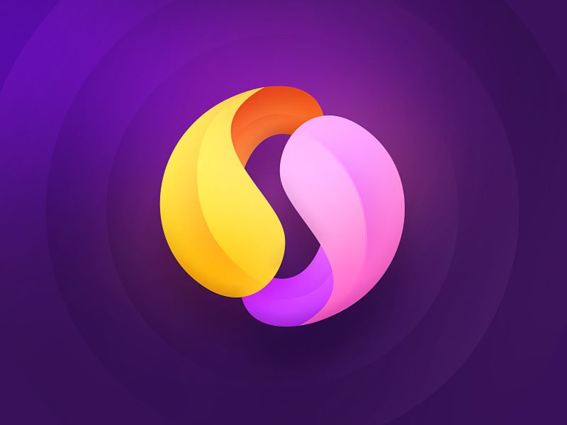
Try color gradients
Color gradients and their use in logos seem to have so much potential right now. A gradient is essentially when different shades of the same hue will transition smoothly from one into the other. This is how you will be able to create a 3D design that has a breathing effect to it. It will also help a logo stand out because of the dynamics and the energy that is involved. One of the tips to keep in mind if you like this style, and plan to get marketing materials printed, is to have your logo designed with all it’s potential use cases in mind. That will ensure that your logo renders beautifully across different mediums.
Make things mysterious
Want to grab the attention of your audience AND keep it? Then we say make your logo intriguing with the tactic of letters that disappear. You can give your logo a feel of mystery by taking out part of the word, leaving a line half-finished, or by simply using colors that fade out. This technique is one that is visually striking but also quite tricky.
The trick is to hit the right balance because if you push too much, you will have a logo that is completely unreadable. Just like in anything else, knowing when to stop is true for logo design as well. Try asking your designer for a few variations to see which one strikes the balance best.
Use negative space in your logo
In general, negative space refers to the empty space around a letter or a design. This free space when used cleverly in a logo can be a wonderful way to get artsy. You can actually get your designer to play around with negative space so that it holds a lot of meaning, creates different shapes and even words.
A logo that has a negative space riddle is one that customers feel drawn to and they want to keep looking at it so that they can solve the riddle. It has an almost hypnotic quality and holds the attention of the viewer until they have read the complete logo and the meaning of it.
Try simple shapes and thin lines

Minimalism is a trend that is here to stay in the world of design. And it will continue to evolve and get even more appealing in the year to come. That is why it is expected to show up in a new way in 2021 logo design trends.
Refined, thin lines are straightforward and look visually appealing as well as stylish. When used alongside simple geometric shapes they can lead to logos that are elegant and airy.
The technique relies on simple geometry as well as sans serif fonts. There are no heavy lines of patterns used. The final result is an elegant and easy to scale piece of art that will look amazing regardless of where and how you choose to place it.
Use symbolic shapes and icons
Many big brands like Nike, Apple or even Starbucks have had symbolic logos for decades. In 2021 it is expected that we’ll see more brands take this on. Symbols and icons are projected to become more popular in the coming year and they won’t just be isolated elements. No, symbols will be blended more and more into the logo designs themselves.
As a brand, you can use symbols to tell people about the value you offer. A symbolic logo can tell people why you specialize in a particular product or service as well. If you want to keep things subtle and impactful, you can incorporate the symbolism into the typography in your logo. Much will depend on the creativity of your designer. So be sure to give them as much context as you can!
Try overlapping for more meaning
Overlapping is popular because it helps people clearly see the connection between two elements. It also contributes to increasing the depth and the dimensions of an image. As part of the 2021 logo design trends, overlapping is expected to take the form of overlapping geometry in particular. This specific trend can be achieved in a few different ways:
- Elements overlapping or even merging into one another.
- You can overlay one color with another.
- Adding layers through element stacking
- You can enhance the transparency of one of the elements used.
The effect of overlapping makes the logo way more eye-catching. And it allows for experimenting and room for your designer to get creative and do something original. This is one trend that is expected to last through not just next year, but over the next few years in general.
Go bold with vivid colors
If you want to make sure that your logo makes a big splash in 2021, the use of vivid, bright and bold as well as garish and brassy colors is something to consider. If your brand personality is bold and vivacious, this is one of the 2021 logo design trends that will really reflect it. You could also use this trend to revamp your existing logo to give your brand a complete and colorful makeover.
Add characters and mascots
One of the other 2021 logo design trends expected to make a big impact is the use of mascots and characters. With the use of the latest techniques and styles, designers are becoming more imaginative in the creation of these characters that are representing the personalities of brands.
Characters and mascots serve as relatable reps for a brand – like spokespeople. And this in turn means that you can use them in a ton of different marketing and branding strategies. For instance you could really bring some great energy to your usual graphic designs like posters and signage. And you can also create more dynamic designs with animation too! All this to say, a logo with a character or mascot isn’t just multi-purpose, it’s multi-dimensional too.
Which 2021 logo design trends will you try?
With so many interesting options amongst the 2021 logo design trends, next year is going to be a fun one for your brand. Whether you’re designing a new logo or revamping an old one, you can really let your imagination run wild. Just make sure that your logo remains readable and gets your brand personality across loud and clear. Apart from that, explore the theme for 2021 fully, and have fun breaking free from rigid boundaries as you explore what’s possible for your brand.

