
The Unbeatable Power Of Blue In Marketing + Design Tips
The phrase “feeling blue” has a different meaning in the branding world. Blue is the most commonly used color in branding and marketing.
And this trend holds good for some of the oldest and biggest brands worldwide.
Don’t you think so? Well, let us do a small experiment.

Think of ten brands that you feel have a large impact on society or your life personally. Did you choose from social media companies, tech companies, and, or lifestyle products? Of course, you would, because we interact with these brands every day.
Out of those ten brands, how many of those have a blue color logo? We are willing to bet that it’s the majority.
Facebook, Twitter, LinkedIn, Zoom, Microsoft., P&G, Southwest Airlines, Ford, and Hp – all brands that we interact with often and have a lot of value in our lives.
The common denominator – the ever-popular blue color in their logos and branding.
So is it just a coincidence? Not by a long shot. In marketing decisions about colors are backed by a lot of data.
The color blue is a powerful element in branding, with its ability to tweak customer perception of a brand favorably. Brands that leverage the power of the color blue have an easier path towards success.
All this by a color? Keep reading and you’ll see how.
Color psychology is no myth and becomes stronger as a fact with continuing research.
So what makes brands favor blue so much? How can you apply this in your branding and marketing too? In this blog by Kimp, we will explore all this and more.
What does the color blue signify?
Color plays a very significant role in the world of marketing. Success in this realm relies heavily on customer emotions and a brand’s ability to successfully evoke the right one. The human brain is highly visual in nature and more receptive to colors than any other element. So color is the tool that no marketers can or will ignore.
To truly understand the role and meaning of a color, three factors come into play.
Color Psychology
Color psychology, as we all know, is the branch of science that focuses on how our brain perceives different colors and the emotions that connect to them. So what does it say about blue? Why is it the most popular color in branding? Is it a trend that caught on, or is there more to it?
It is definitely not just a trend. Blue has very positive associations right from the beginning of time and, by association, brands also reap the benefits of these associations.
Blue as a color has a long-standing connection with water and that evokes emotions of purity, cleanliness, calm, stability, essential products, and so on.


But people also perceive blue as being the color of trust, and that is a curious case of reverse association. Let’s understand it from a cultural context which is also the second context for understanding the significance of color.
Cultural contexts
Remember how we told you that brands chose blue because it has many possible associations?
Well as many large brands adopted blue as their color, the color began to become associated with the qualities that the brands stood for. Since these brands had been around for a long time, their attributes of trust, reliability, and professionalism rubbed on the reputation for blue. And that is one case of evolving culture.
This comes in handy when your target audience is the demographic that grrew up with this culture.
There are other cultural contexts to the power of blue in marketing too.
In the Western world, cultures that follow Christianity tend to favor blue and other lighter shades than the warmer tones, as they have a long association with the churches. This started when the team building Saint Denis Basilica in Paris literally brought the color inside the church with their cobalt-stained windows. This soon started a trend in churches worldwide.
.jpg/1200px-Stained_glass_%40_Basilique_de_Saint-Denis_%40_Saint-Denis_(30675936826).jpg)
Demographic references
In the past, blue was widely used to signify products that were for men and boys. While this is a cultural thing in many parts of the world, it may not go down too well with the likes of Millennials and Gen Z who often view this notion as outdated. So if they’re your target audience be sure to factor that into your decisions on how you use blue in marketing.
And this isn’t to say you shouldn’t use blue at all. Just to be thoughtful on its applications.
Millennials and Gen Z like branding and marketing designs that use earth-related or nature-inspired elements. And blue works for both these themes, so use the right shade of blue in your branding and you are all set.
Blue is nearly everyone’s favorite color, right? Right from older, conservative generations to younger, more liberal generations – everyone likes blue. And precisely for this reason, blue finds itself constantly in all major branding and marketing campaigns.
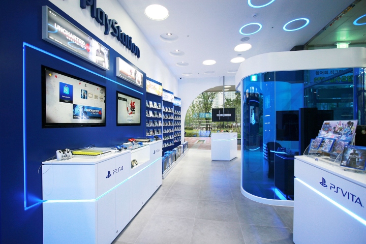
Above is Sony PlayStation’s VR-based showroom which uses electric blue to appeal to a younger demographic.
The popularity of Blue in Branding
As we have seen repeatedly, blue features heavily in logos of brands of all sizes. But that is not all it does in branding. Websites, store displays, and packaging designs are all a significant part of branding designs, and, of course, blue takes the spotlight in those too.
Let’s take a look at some of the most popular and well-done uses of blue in branding designs around the world.
Blue in logo Designs
On the internet, you will find scores of articles that will tell you that blue is the most used logo color, and it suits some industries more than others. It is true in some sense, but as you see from the examples we have cited and will continue to cite in this blog, there is no true limit to this color’s popularity.
Let us take a look at the two examples we have below. BMW and Dominos Pizza. One is a world-renowned automobile brand with a very high-paying clientele, while the other is an everyday pizza chain that everyone accesses.
/cdn.vox-cdn.com/uploads/chorus_image/image/66439957/aDzH7sHpSJ9ivMQhPMiwT5_1024_80.0.jpg)
Kimp Tip: While both these brands have blue in their logo, you will note that the shades they use are widely different. And this is to appeal to their target audiences and ensure that they are associated with certain ideas. So pick the right shade, and be sure to associate yourself with the right ideas.
Blue in Website design
Branding does not stop with logo design. Every customer touchpoint that helps customers form an impression of your brand contributes to branding. Also, website experience is a major factor in a user becoming a customer or leaving just a visitor.
Since blue evokes the feeling of calm, stability, and clarity in customers, it is a brilliant choice for your website design.
Breaking the divide between different industries once more, let’s take a look at two of our favorite website examples. As a financial firm, Stripe uses blue to evoke confidence and trust in its users.

Alternatively, the Lake Nona website also tells us that blue is a tremendous choice for real estate businesses, too. Two widely opposing industries – Fintech and Real estate have a unifying theme of trust in their preferred customer responses and end up using blue.

Kimp Tip: Both these examples show us unique ways to employ the color blue. The Stripe website starts with an engaging gradient usage and then transitions to different shades to play with color psychology and visual hierarchy.
The Lake Nova website takes it a step ahead and builds a blue-based color palette, despite being a prominently image-led website. The blue in each image shines through, reinforcing brand identity and leveraging the power of blue.
Looking for unique ways to use blue in your branding? Sign up a Kimp Graphics subscription, and our team will guide you through this.
Blue in Packaging design
In the retail world, your packaging design is often the first customer touchpoint, even before the logo or the website. It is how attractive a product is on the shelf that ultimately decides the success of a brand. Using blue in packaging design is a great way to make people notice your product. It is the most liked color worldwide, so you can cross the first barrier to connecting with customers easily.
Blue is also quite attractive across different materials and shapes. That is why it is the leading choice for bottle colors in the FMCG industry. Take the award-winning design by Shenzhen Lingyun. Their design GuoCuiWuDu is a classic example of a vintage design with a modern touch. In an ode to the spirit reference in Chinese culture, the liquor comes in a transparent blue bottle. It is a classic use of the cultural connotations of the color blue.


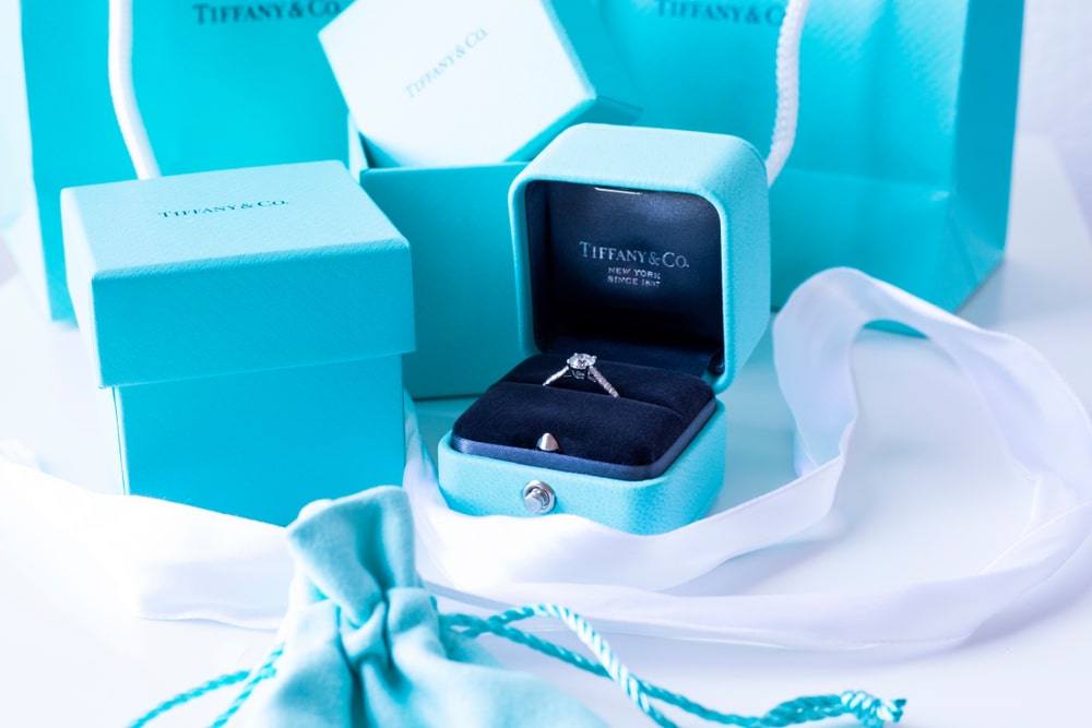
When we talk about package design and recognition, how can we not talk about Tiffany & Co.?
It will overjoy anyone who loves jewelry to see that little blue bag because it means their favorite gift is here. Tiffany stores use the same color in their decor to give it a regal and royal vibe. The color is so special that the brand now owns this particular shade. Yes, Pantone 1837 is its own, and they picked 1837 to signify the year they started.
Picking Blue for your Marketing campaigns
Well, blue has been very effective in branding campaigns. No wonder it is the most used color in branding worldwide. But is that all blue can do for a business? What if the color blue does not fit your particular brand personality or industry? Can you still reap the benefits of this color?
The good news is that the power of blue does not limit itself to branding campaigns. Blue can work wonders in marketing campaigns, too.
Blue in landing pages
Color plays a very significant role in landing pages. In fact, a HubSpot study of A/B testing showed us that varying the color of CTA buttons increased conversion rates, even if nothing else is different. This is a great metric to strive for and lets us see how blue works in landing pages.
Brands usually employ landing pages to either sell a product or collect data that will eventually come in handy in sales. Both of these processes require trust and confidence from the customer.
If you have blue-based landing pages, the customer will infer that you are a trustworthy brand and be more open to sharing information. Blue is also very pleasant on the eyes and can make for a better UX than other warm high contrast colors.


Kimp Tip: In both of the examples above, the brands have paired blue with neutral shades or white space. But you can experiment with color combinations that complement blue and provide the same emotional response as blue.
Landing pages are very important to brands in optimizing conversions and sales. Looking for a competent team to design one for you? Try a Kimp Graphics subscription.
Blue in Email marketing
Like landing pages, email marketing is key to the success of any brand. In fact, it is the channel that has the potential to deliver the highest ever ROI across any platform. So you must optimize to the best possible extent.
Now how can you do that, and does color really play a role in that? Well, let’s take a look.
The color you use in your email appeals uniquely to each customer based on their buyers’ journey. By using the right shade of blue, you can appeal to each type of shopper.

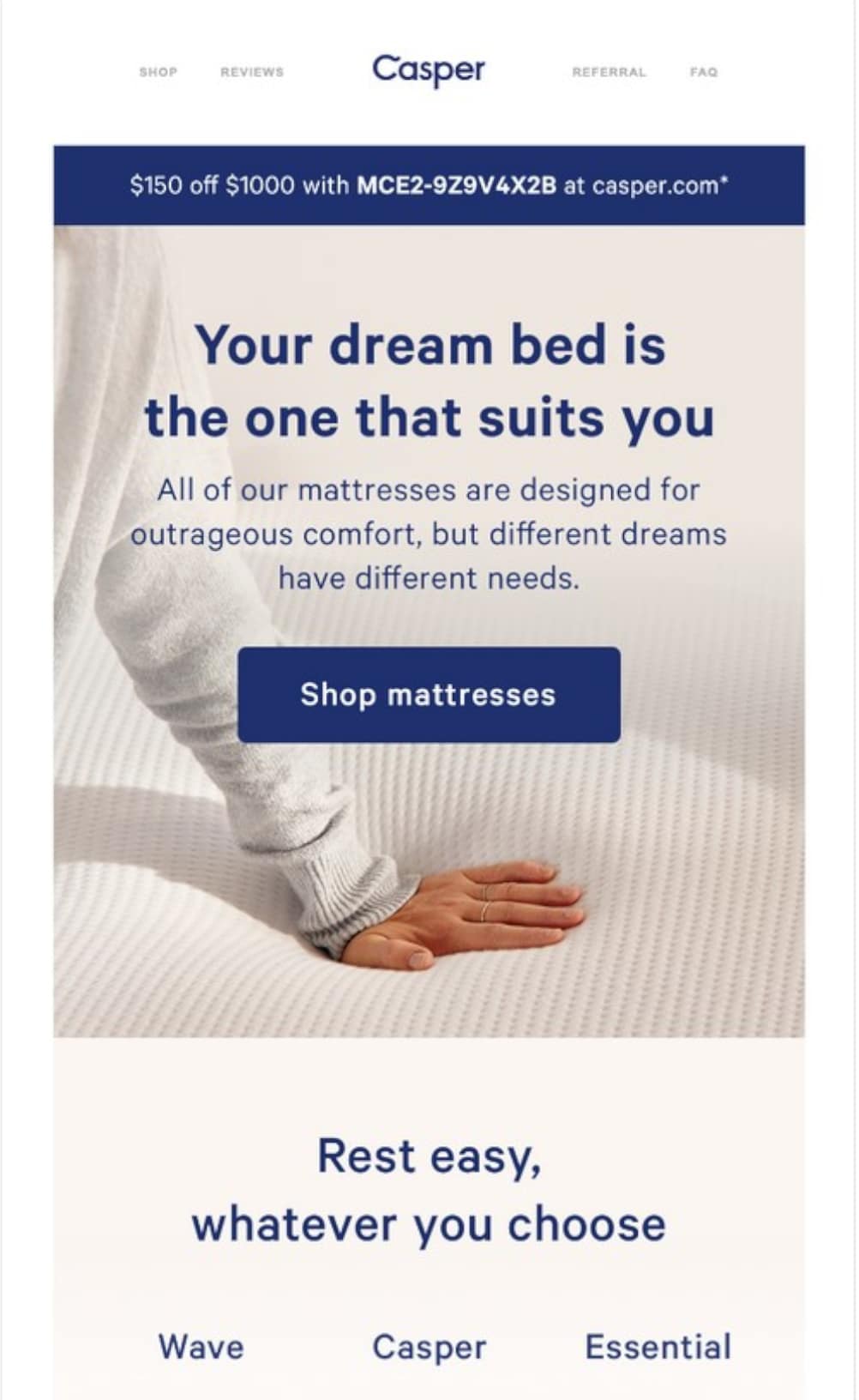
Kimp Tip: Did you notice how Casper picked different shades of blue for unique elements of email marketing? By doing this, they leverage color psychology and improve the readability of the overall email too.
Now, that is good design thinking. You must also remember to optimize your emails for dark mode viewing when you use an extensive amount of blue.
Looking to create similar emails for your brand? With Kimp Graphics’ unlimited design subscription, you can work with a dedicated design on your designs for a flat monthly fee.
Blue in Social media marketing
Social media marketing is a different ball game altogether. As younger generations dominate social media platforms, they look for unique attributes for a color to fill their screen.
Blue is an inclusive color to the colorblind population of the world. Nearly 10% of people cannot perceive red and green colors in the primary color set. Blue is a savior for them and allows them to experience social media like everyone else.
Blue is also a favorite color for many, as they see it everywhere and have many fond ideas and memories attached to it.
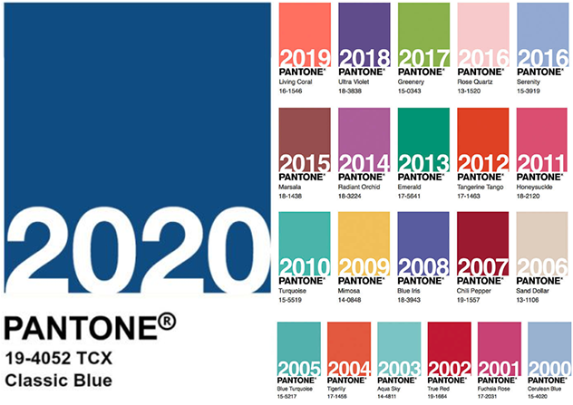
People love trends on social media too, and the Pantone Color Institute has chosen more blue shades as the color of the year in the last two decades than any other. This makes it quite popular on social media.
Blue in OOH advertising
The world does not run on digital platforms alone. In fact, some Out Of Home (OOH) advertisements like billboards, standees, vehicle wraps, and bench ads can sometimes yield better returns.
Knowing this, brands have repeatedly experimented with the color blue on billboards and other OOH advertisements. And it has been a little tricky. Why? Well, because we can visually perceive warmer colors much better than cooler ones and that means blue is difficult to notice on the road.
Not to mention the printing difficulties with some blue shades that pose an issue of branding inconsistency. But it is not impossible to do, as you can see from the examples below.
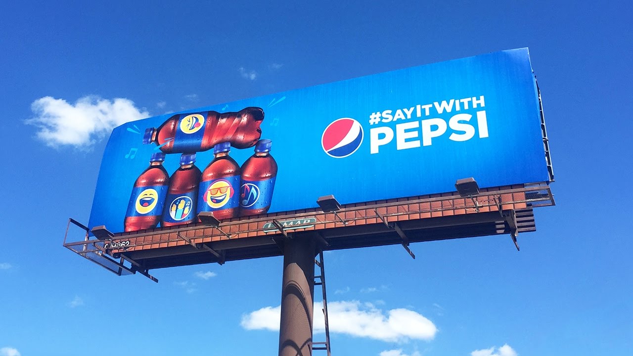

What is the secret? Use the right color combinations that leverage warmer colors for attention and use blue for messaging and branding reasons.
Kimp Tip: Blue is a tricky color to find consistency with across physical and digital mediums. The right place to start is to inform your design team that you need the same color across both mediums. This way, they can pick a color that is easy to replicate via the Pantone system or using CMYK codes when they are going from digital to print.
Get your brand the power of Blue with Kimp
Blue feels like a great color to be an advocate for your brand, right? It has a universal appeal and works well in most use cases. But here is the catch. As simple as it looks, there are many shades within the color blue, not to count the many hues that come from it too.
And it takes an expert eye to pick the right one for your brand’s core purpose and messaging.
Kimp can be that expert eye for your brand. Our Kimp Graphics and Kimp Video subscriptions match you up with a design team and offer unlimited design requests with unlimited design revisions.
You can also choose from a wide range of design categories to suit your marketing needs.
So why? All this comes to you at a flat monthly fee and a free trial offer for 7-days before you commit.
Sign up and start designing today.